In mid August, a video was published of a little boy covered in blood, being pulled from the rubble in Aleppo, Syria, and put into the back of an ambulance following an airstrike - this video was shocking, it was horrific and it made me feel sick to my core. Omran, the little boy, along with a handful of other Syrian children who have made the news over the past years, represent almost 8 million children affected by the conflict that has been raging in Syria for over 5 years (a lifetime for many of these children).
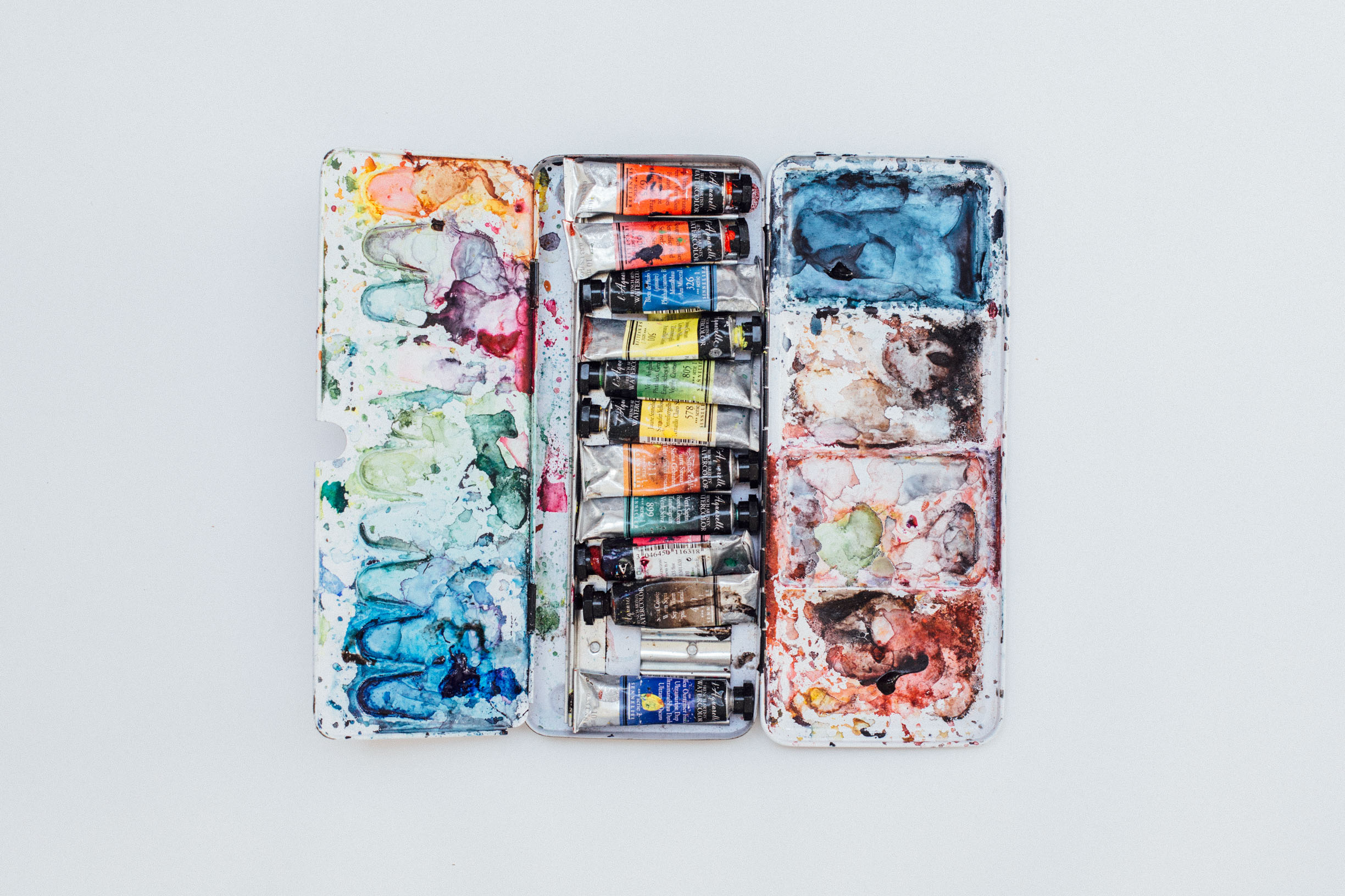
I am not well-versed in politics, nor would I consider my self to be immersed in world events, but I know when something feels seriously wrong. Upon seeing this video, I felt severe sorrow and helplessness - so I jumped onto Google to see what could be done from an ocean away. I found a number of organisations who were reputable and contributing emergency aid to refugees and decided to self-initiate a project in hopes of raising funds for this cause. I decided to create a series of original paintings for sale at an affordable price in which ALL proceeds will go to emergency aid for Syrian refugees.
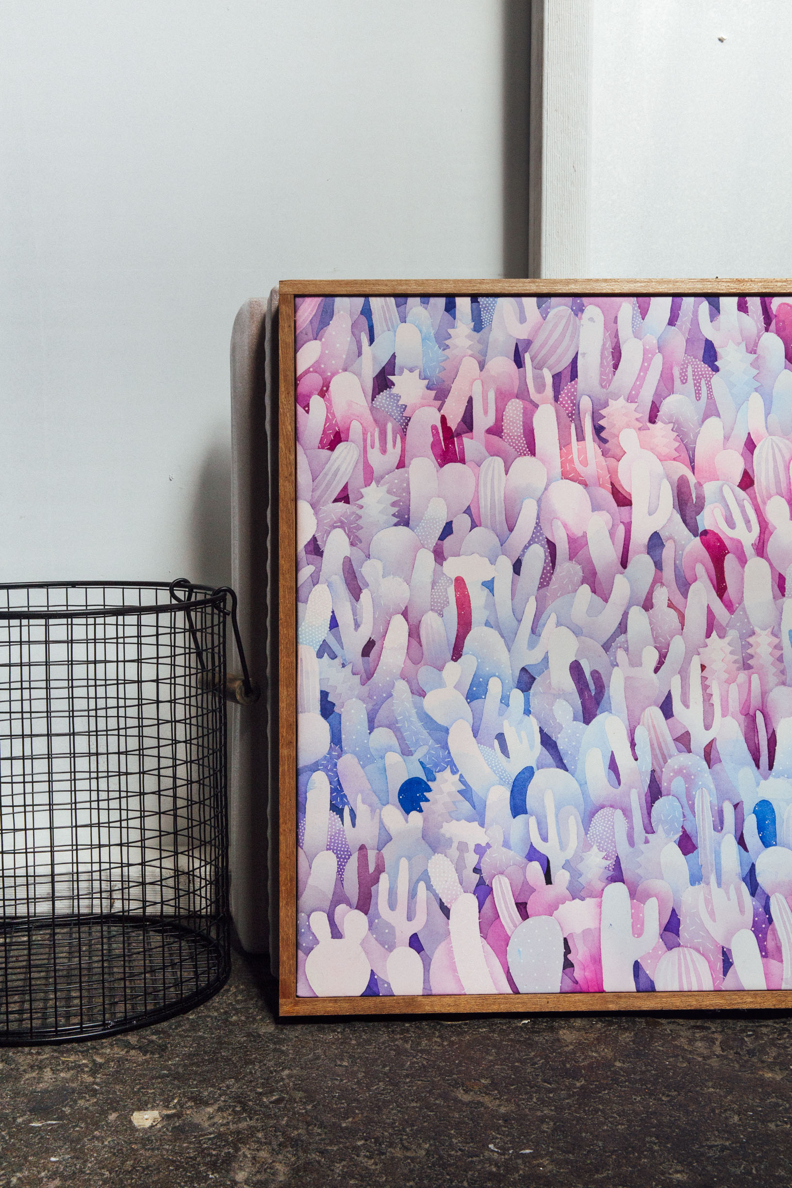
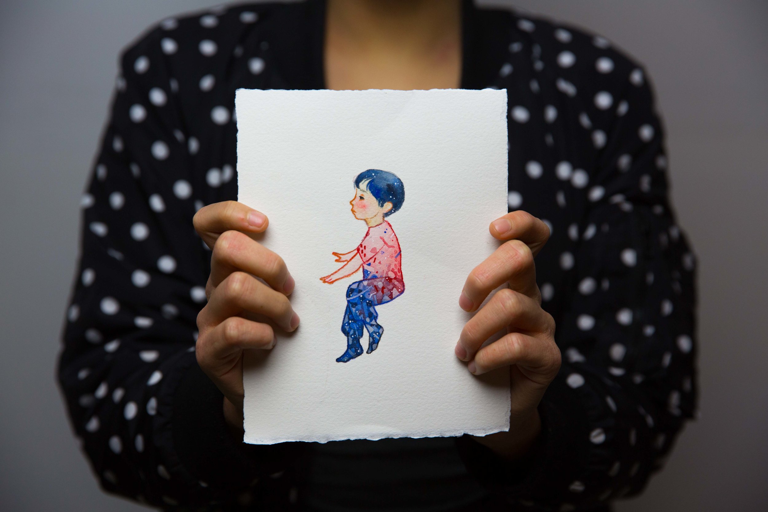
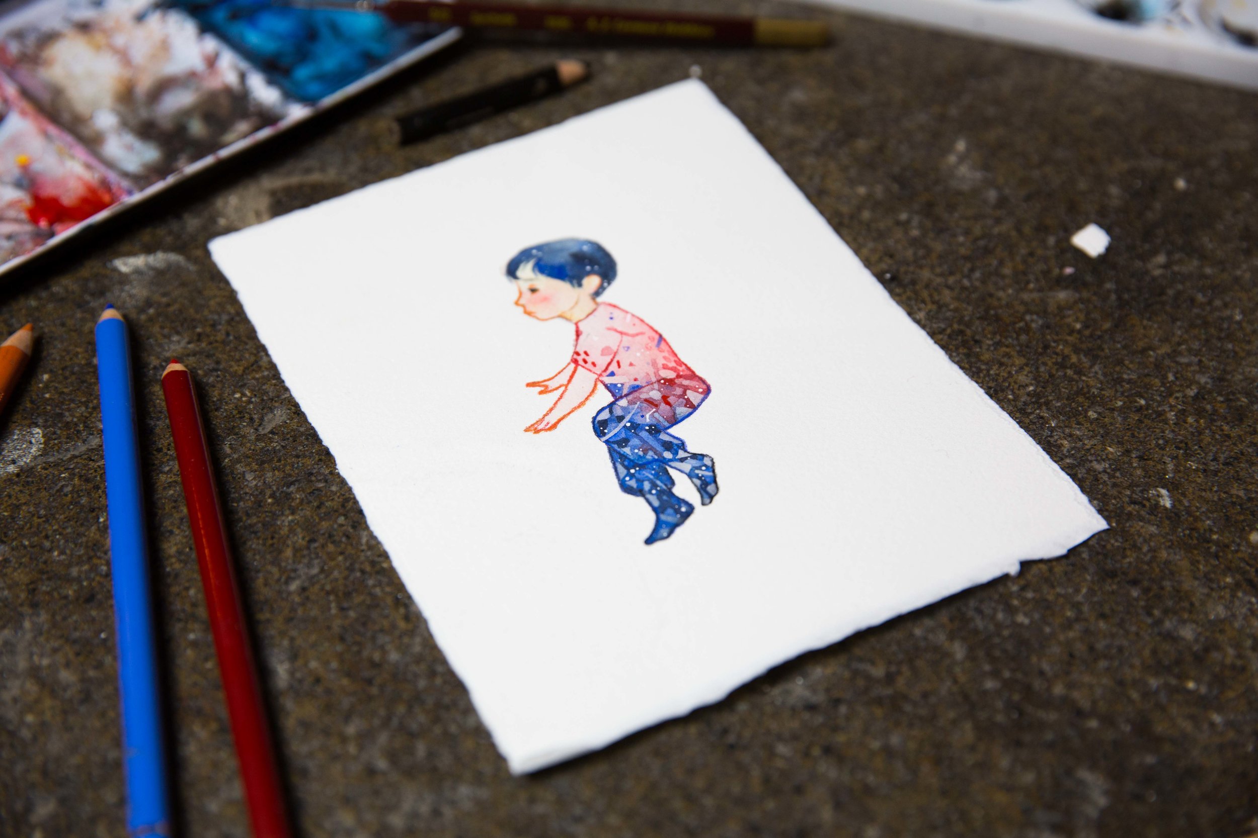
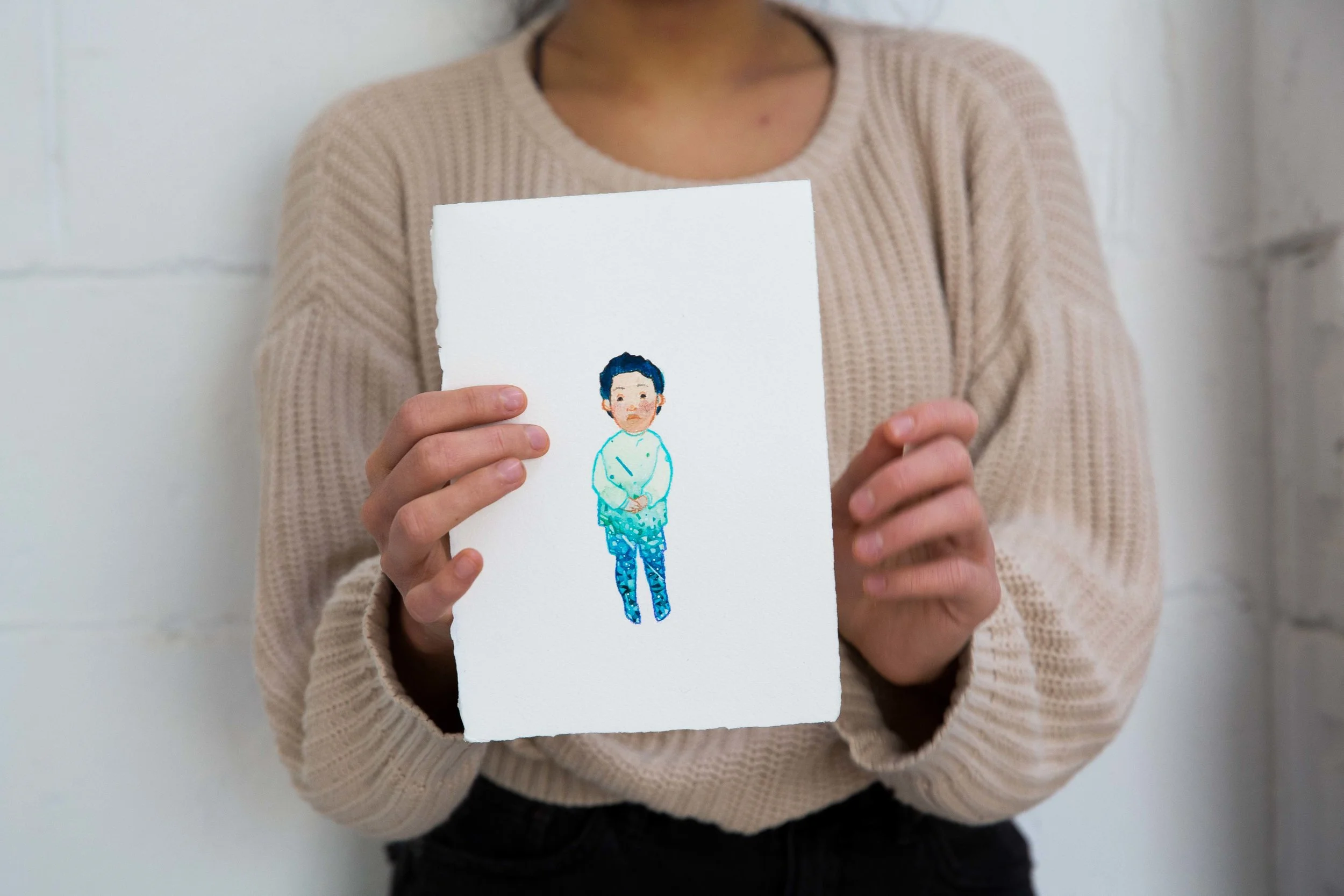
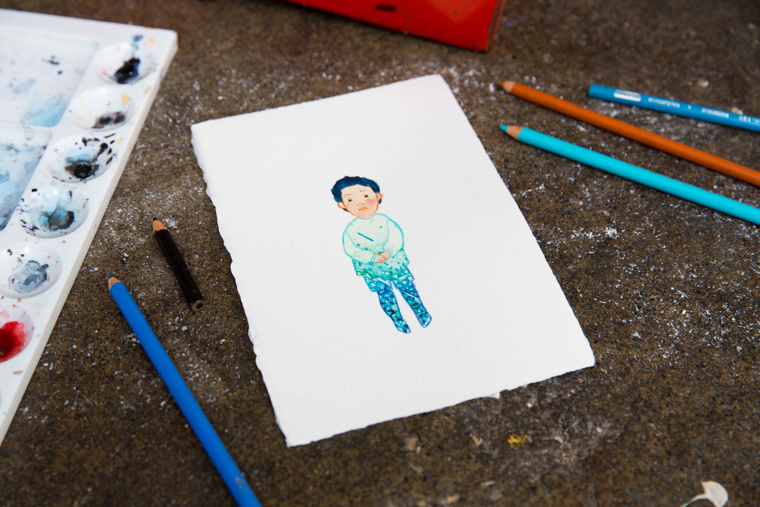
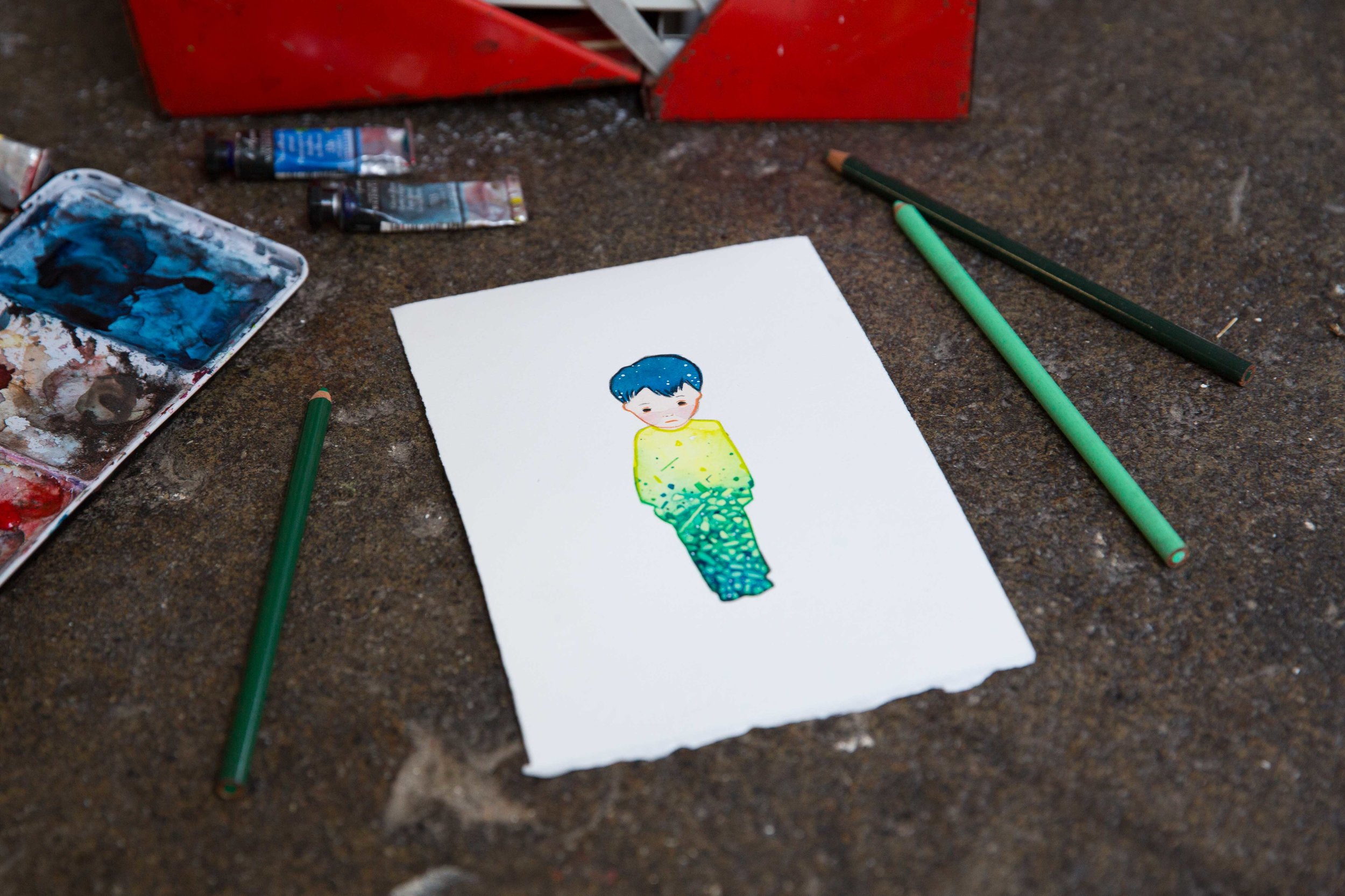
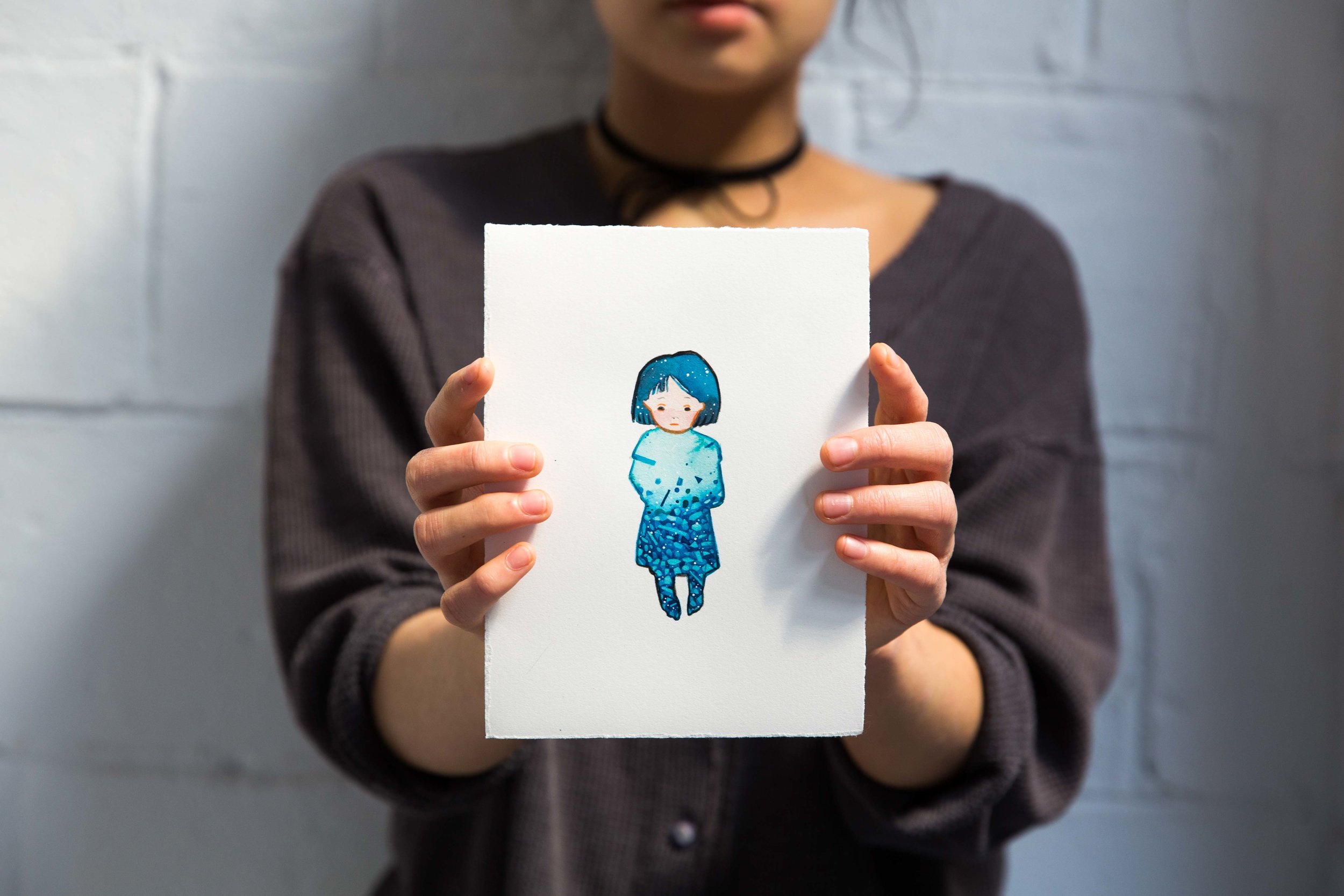
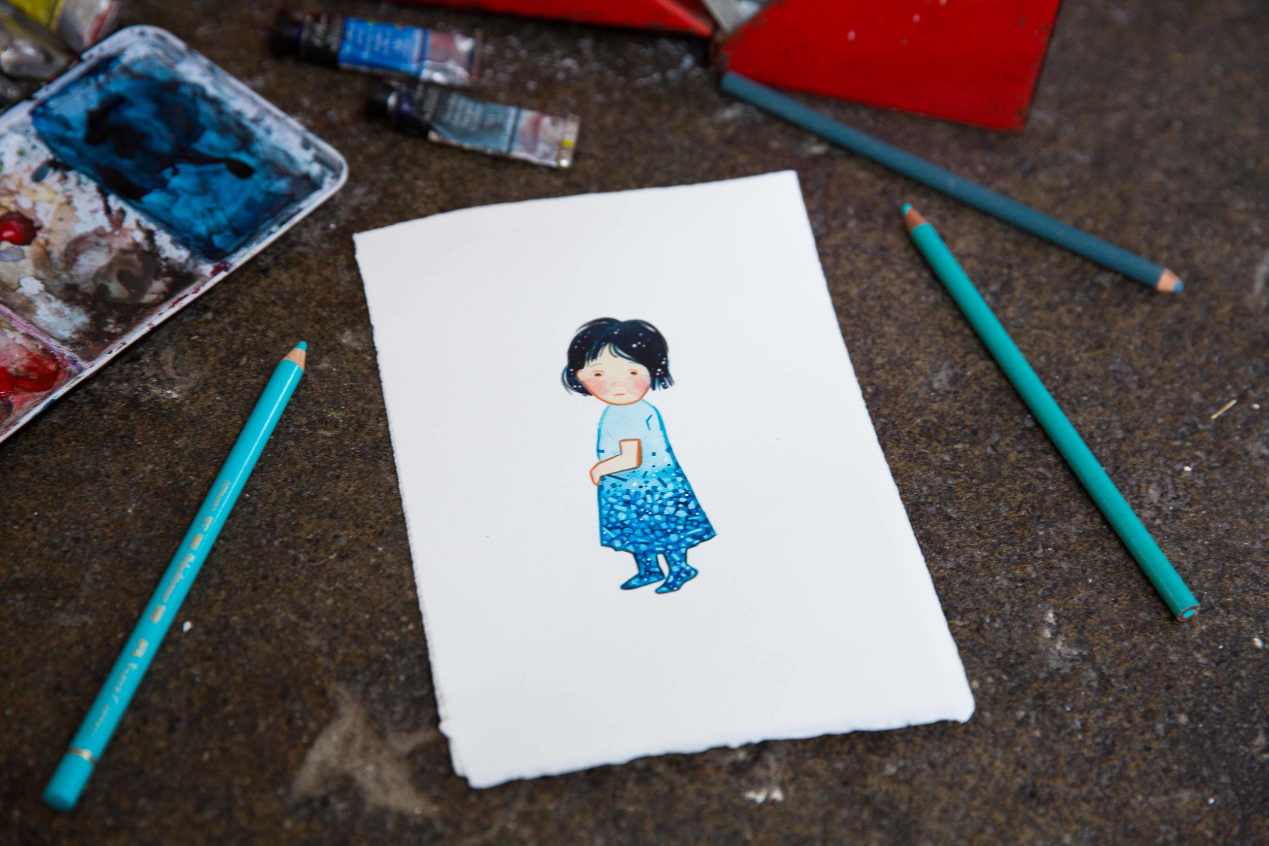
This is what my project looks like.
Over the next week, I will release two artworks a day, inspired by the children shown in the media who have been affected by the conflict in Syria. Each artwork represents over 1,000 children who have reportedly paid for this war with their lives - that's over 14,000 innocent children who have died in the past 5 years. Each original artwork will cost $140 AUD, and that $140 AUD in full will be donated to Care Australia. I will cover the postage, and handling.
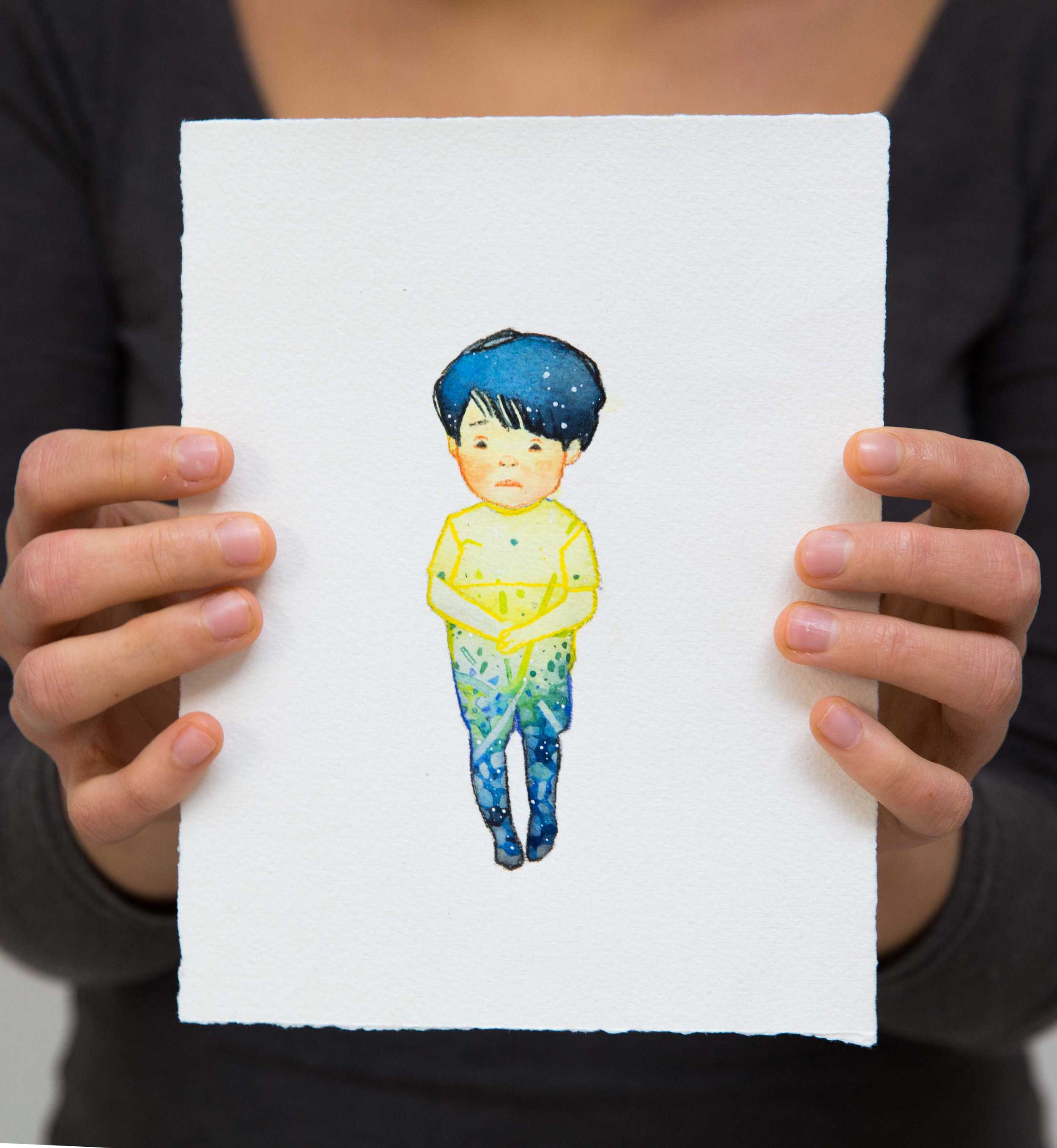
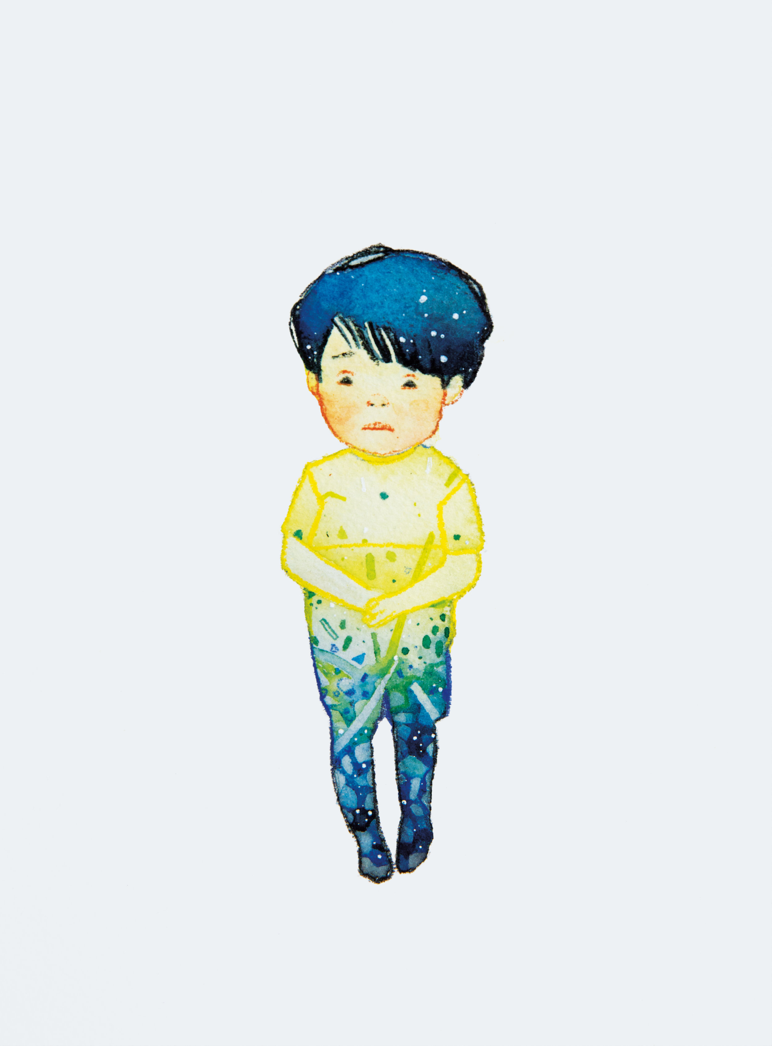
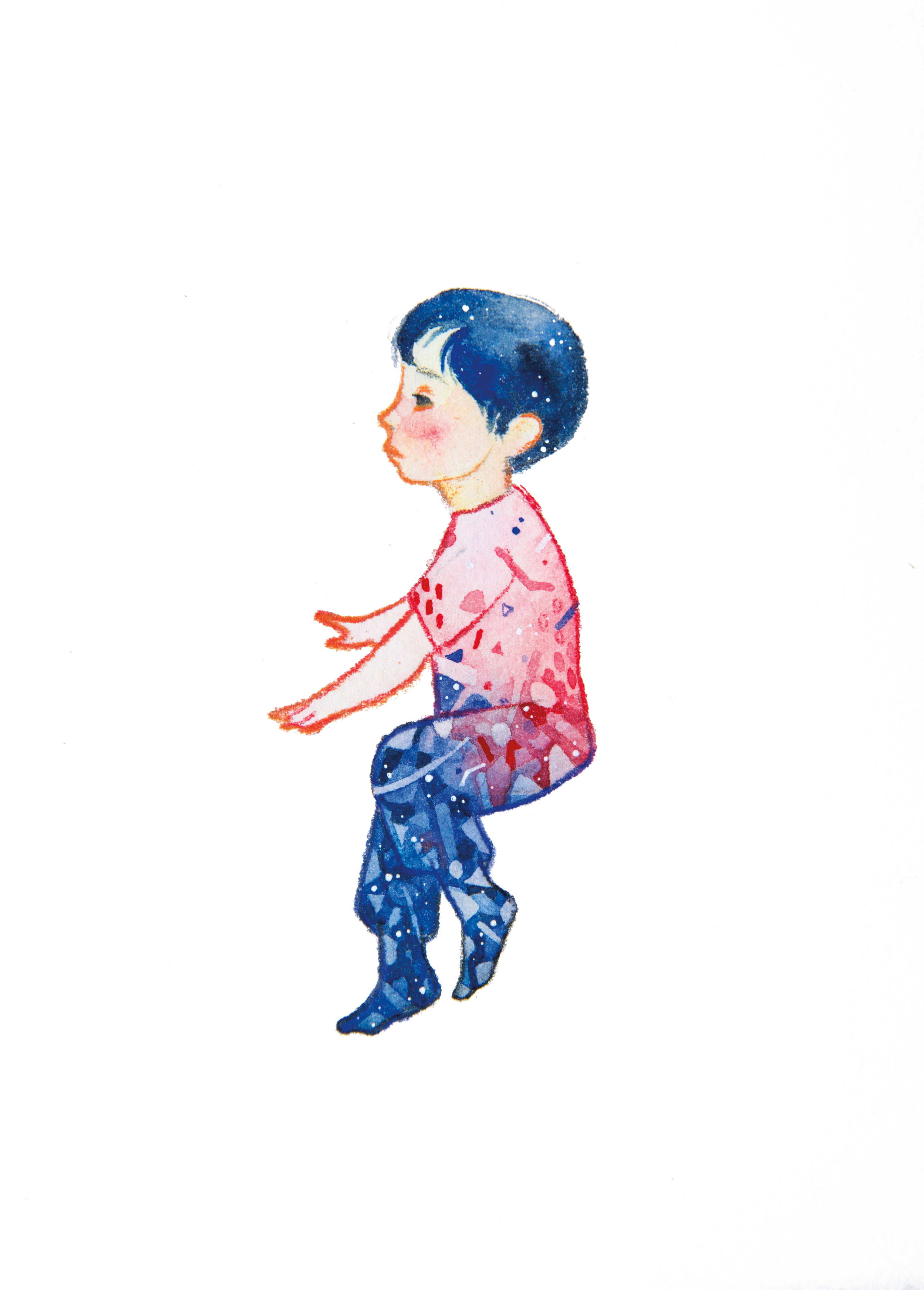
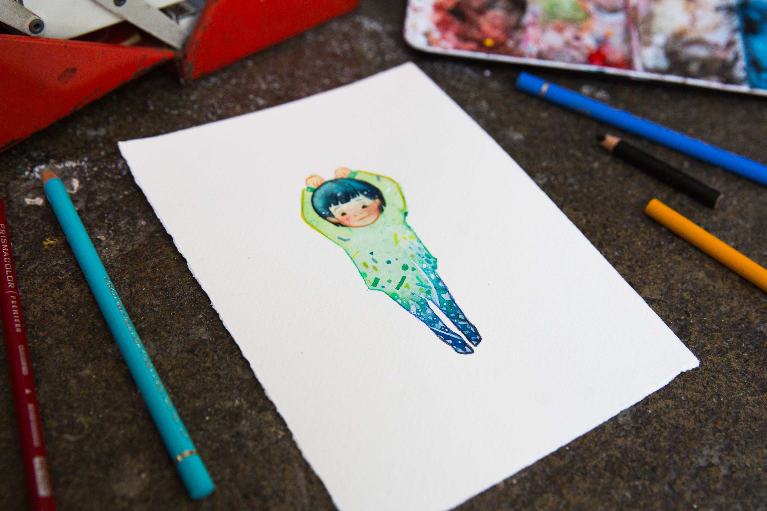
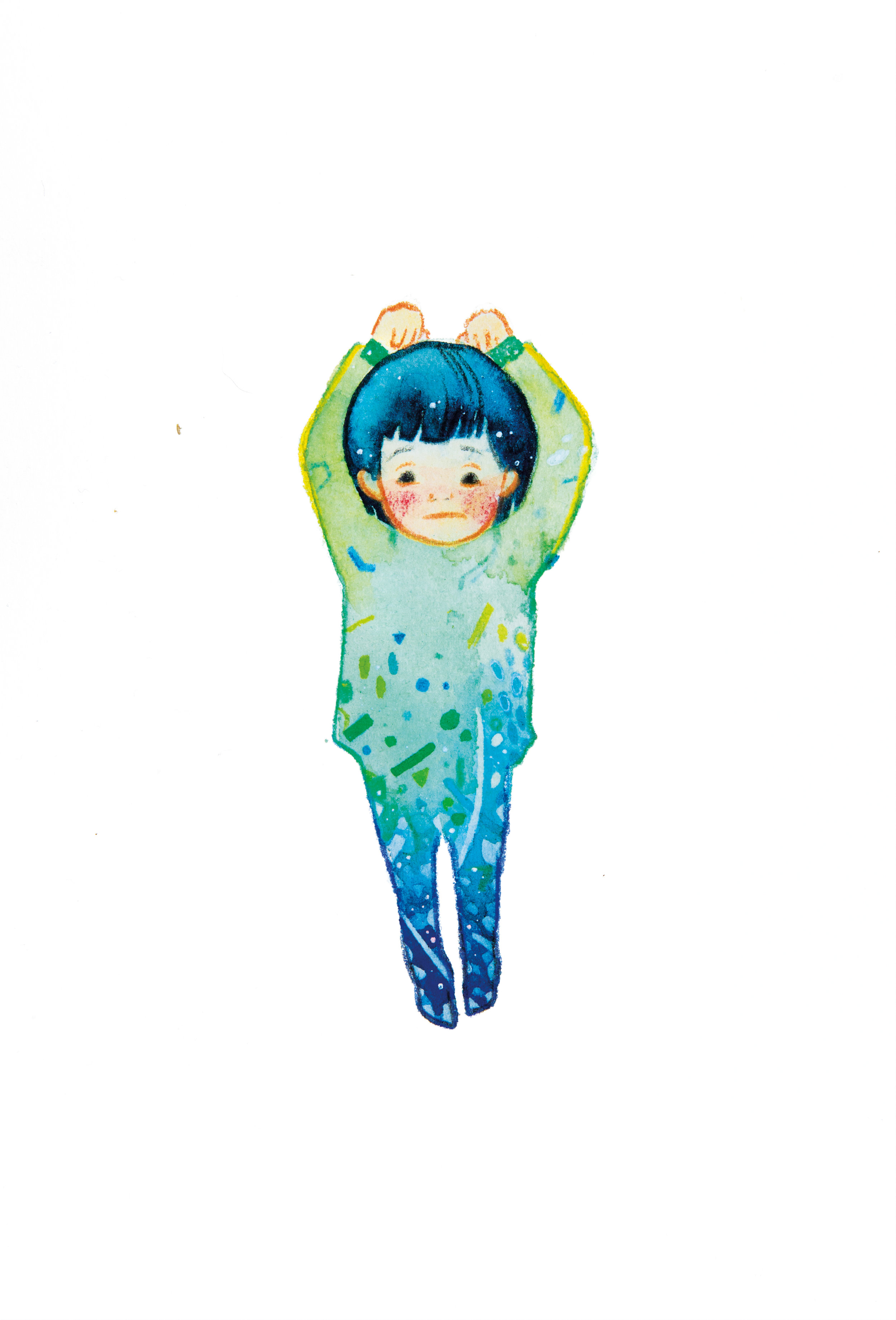
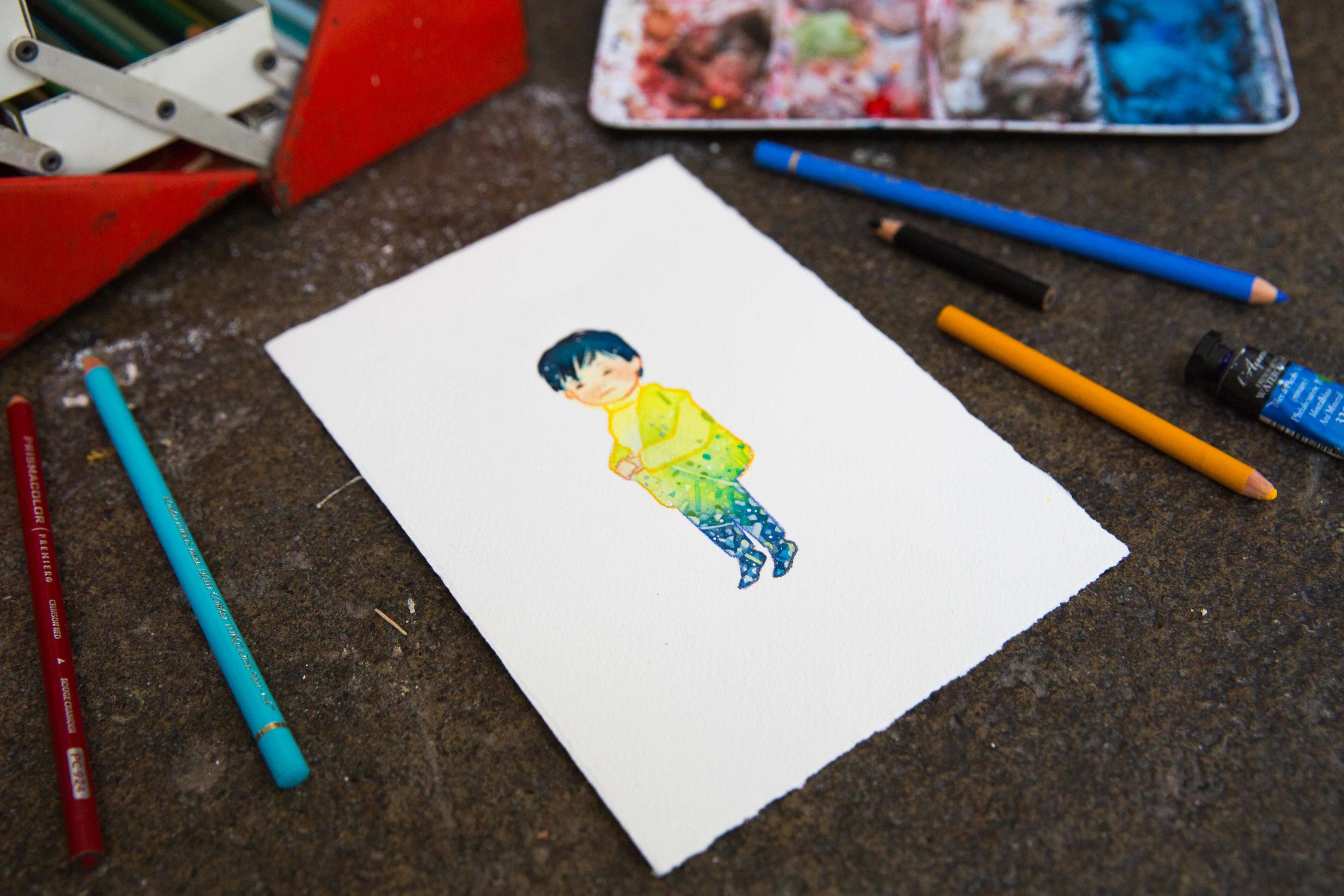
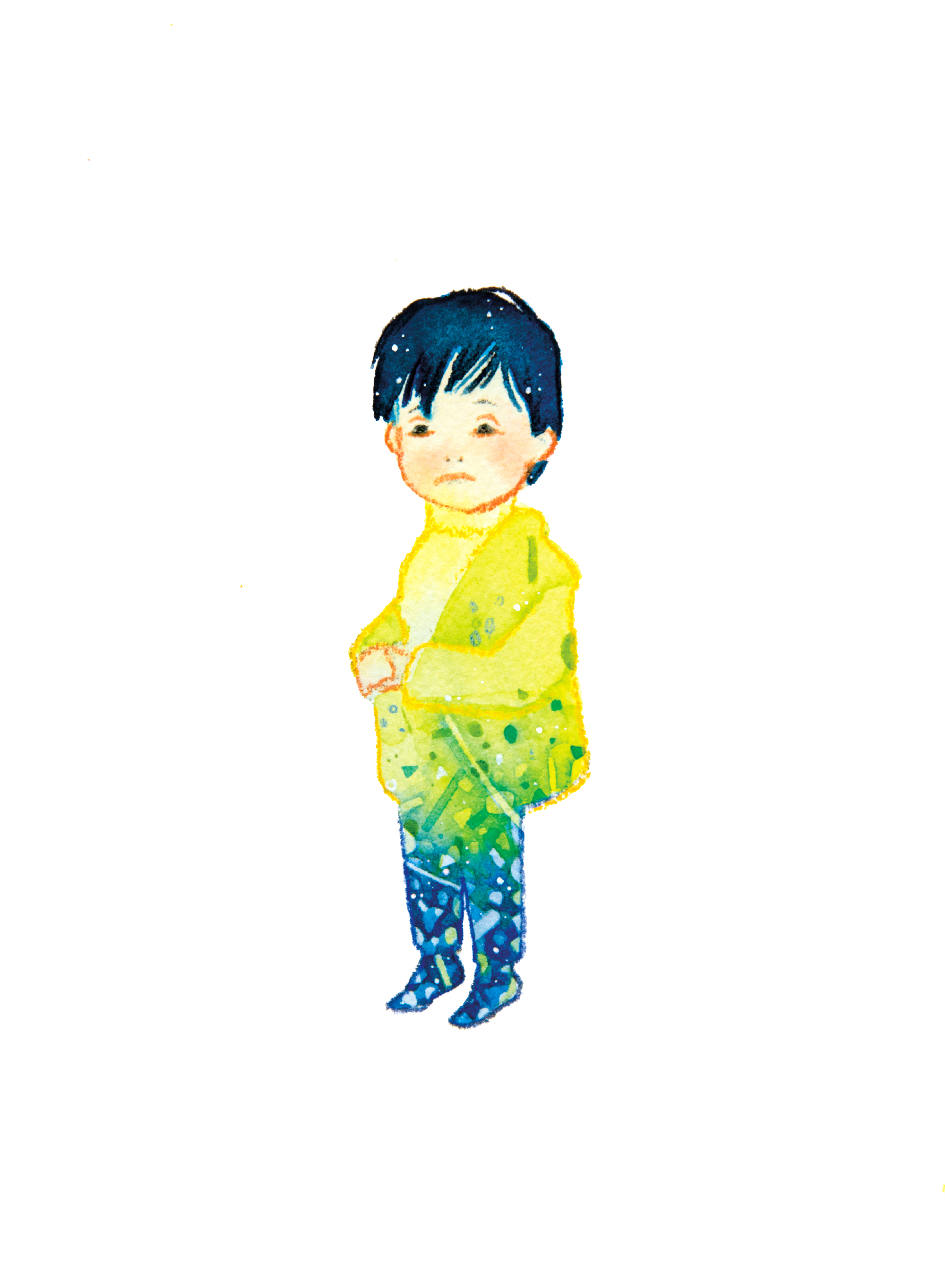
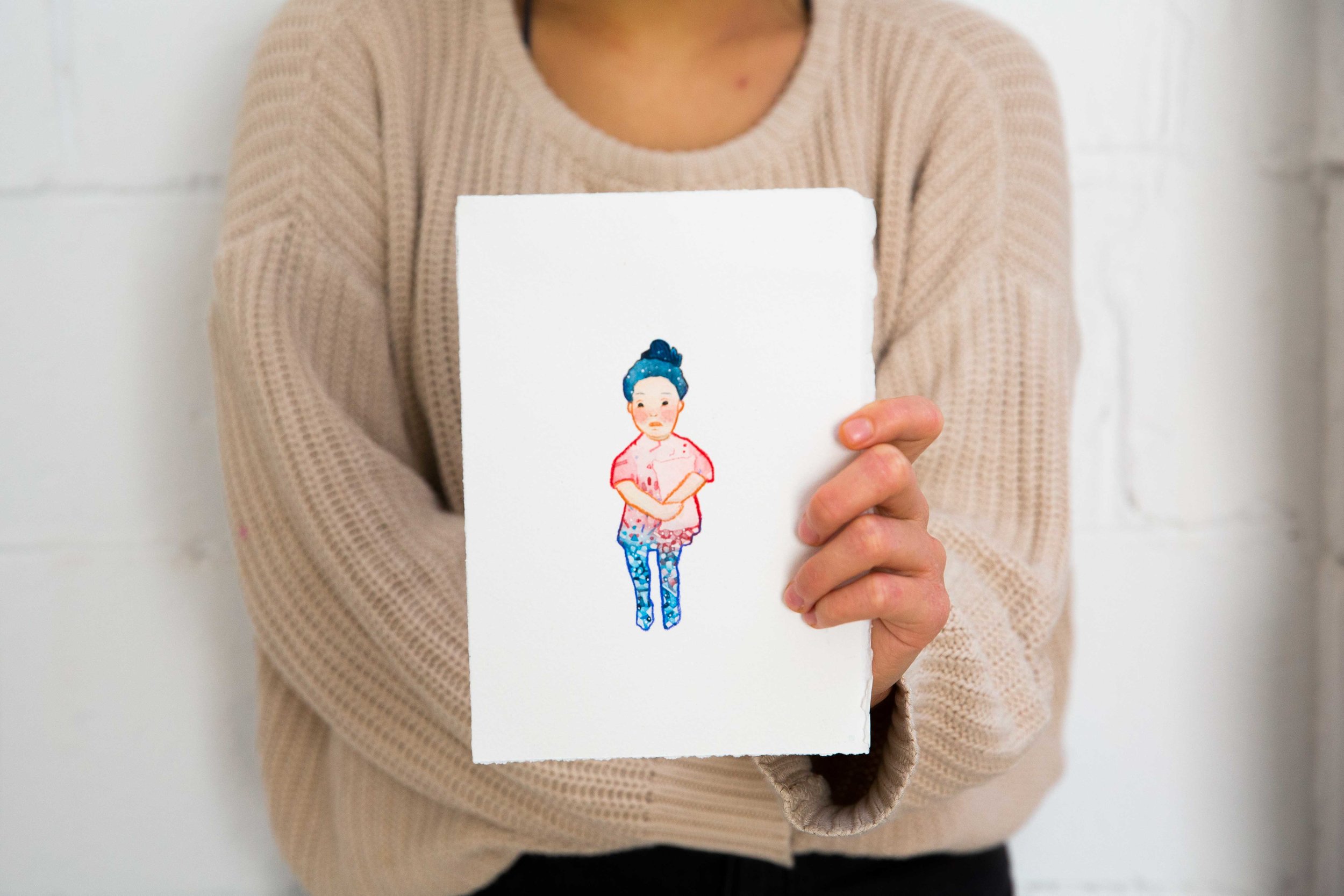
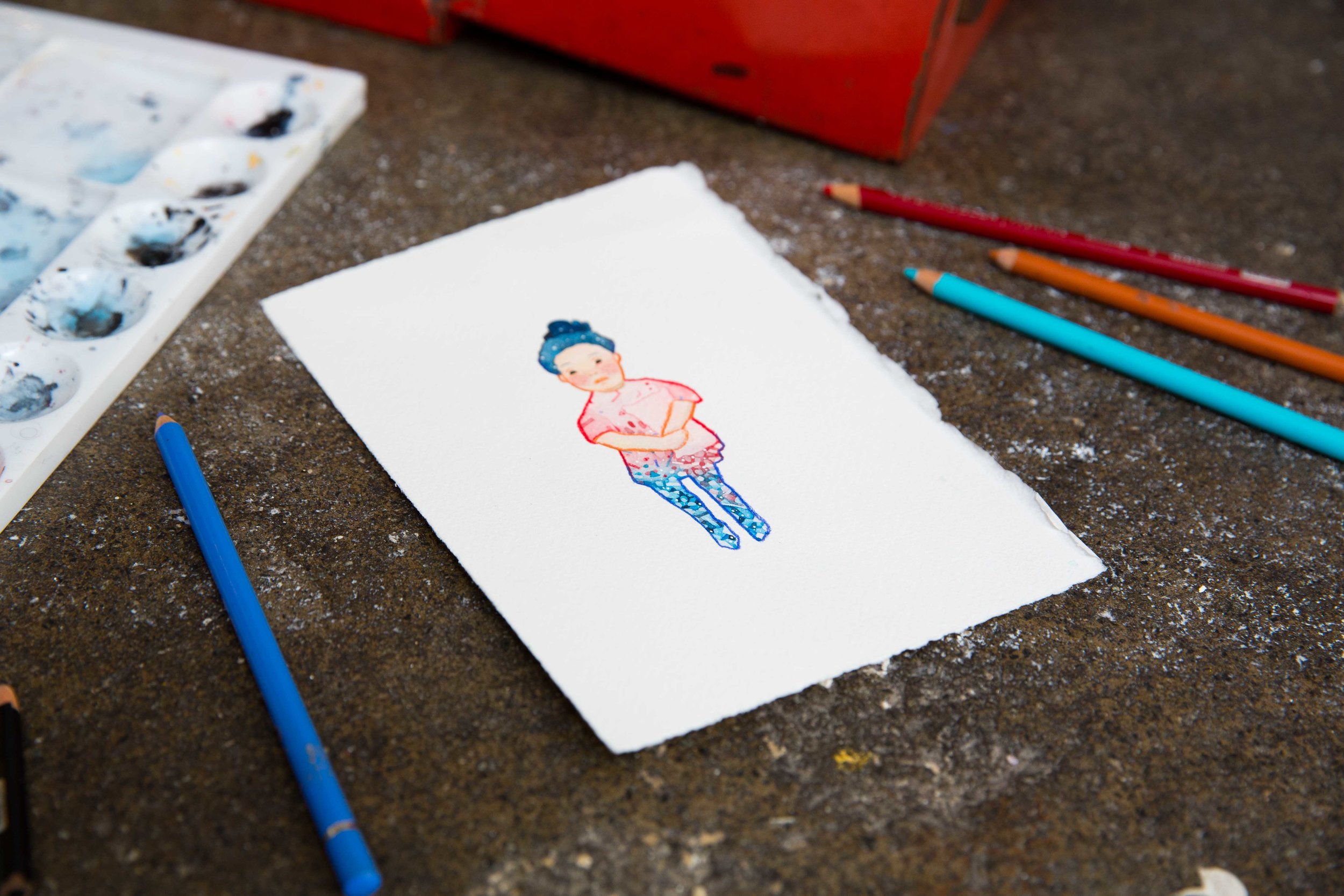
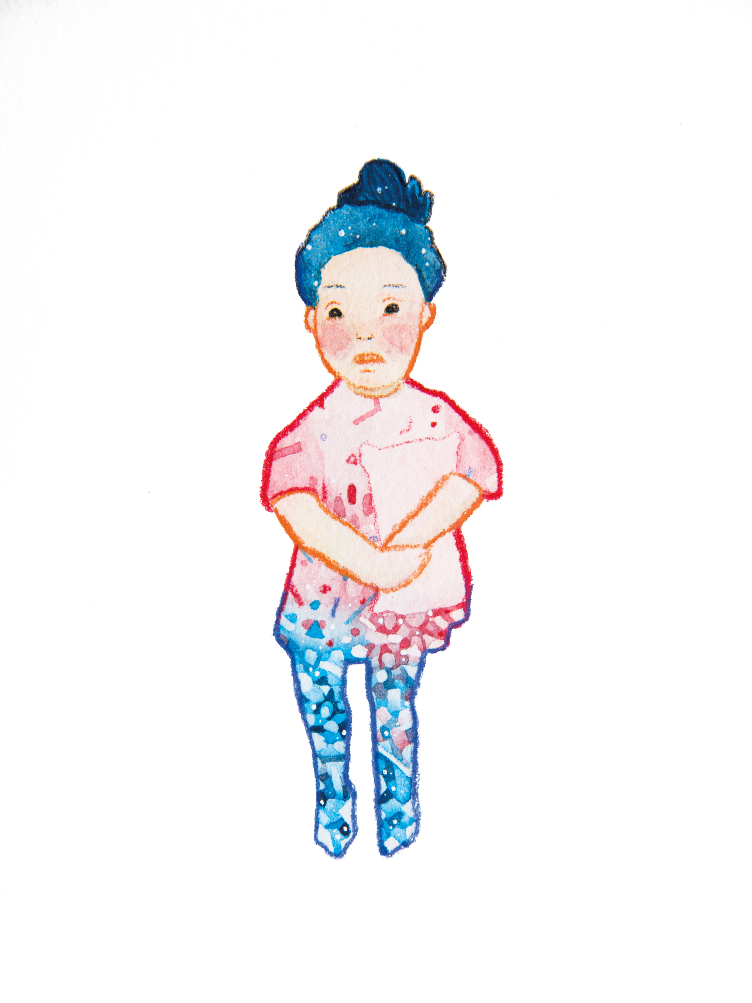
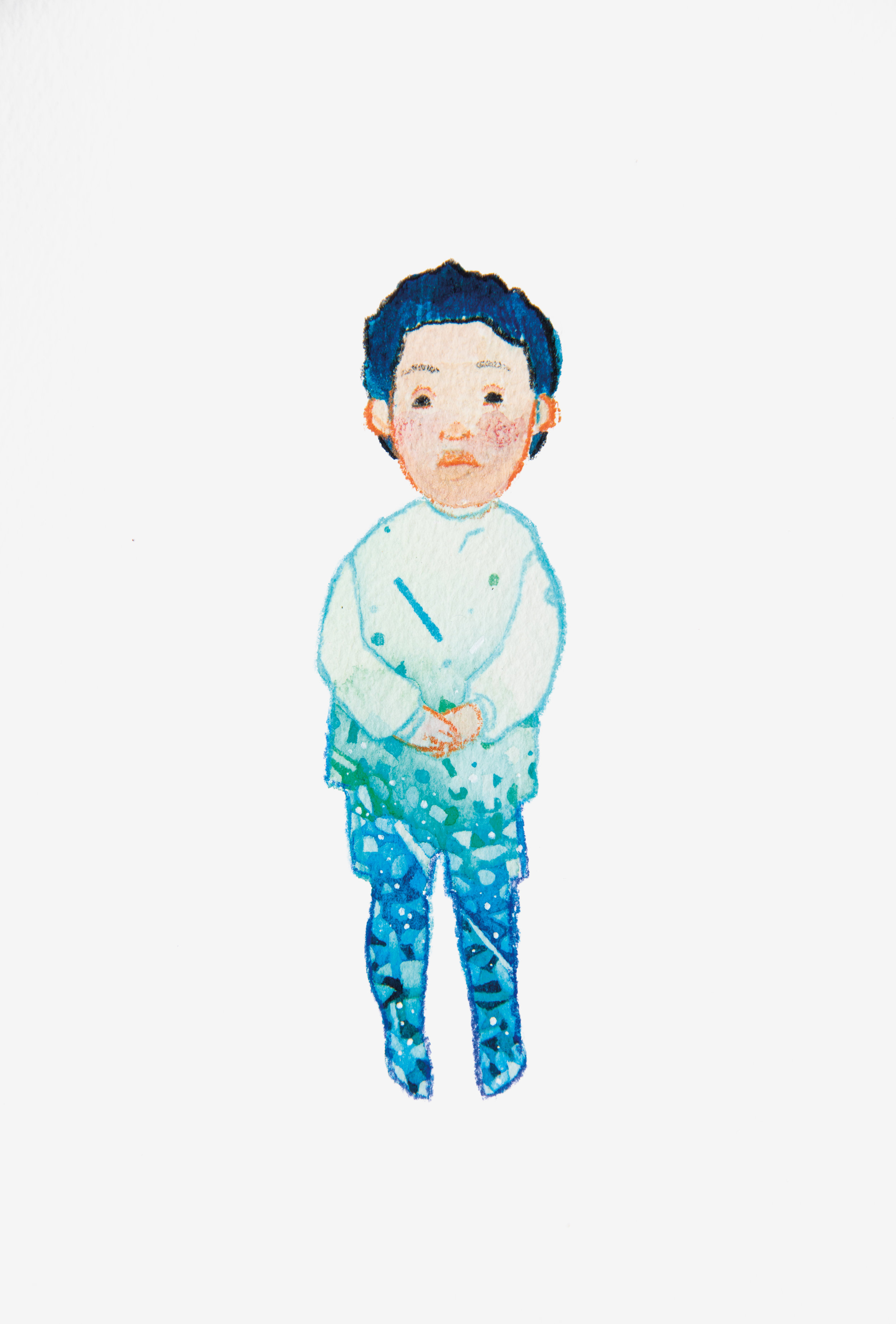
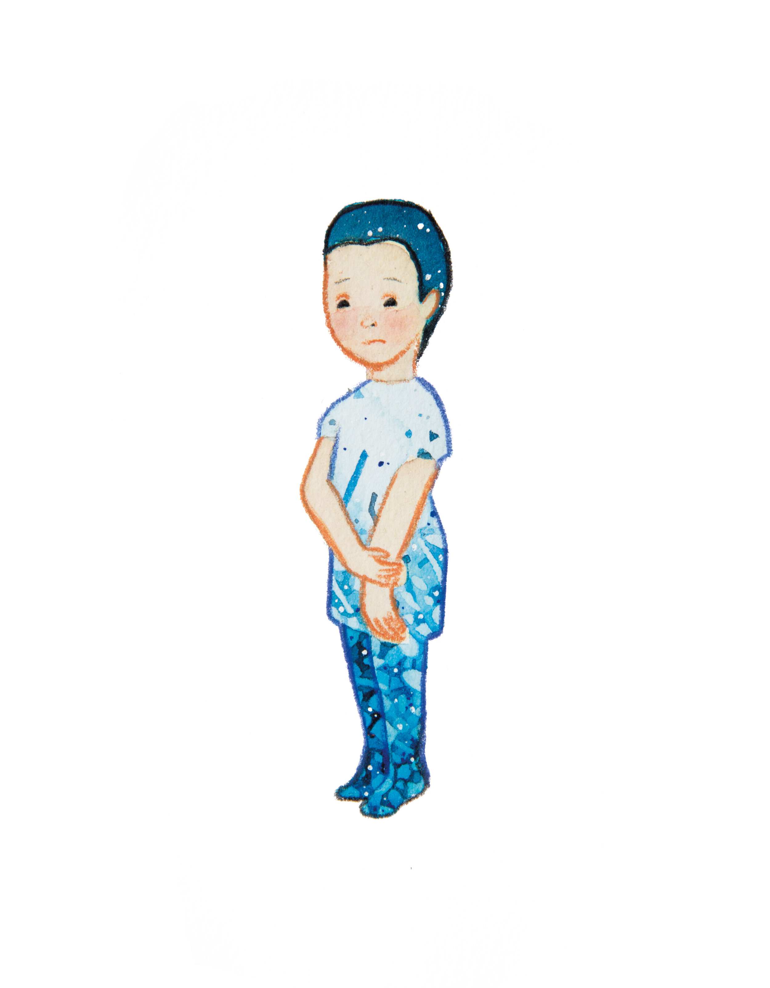
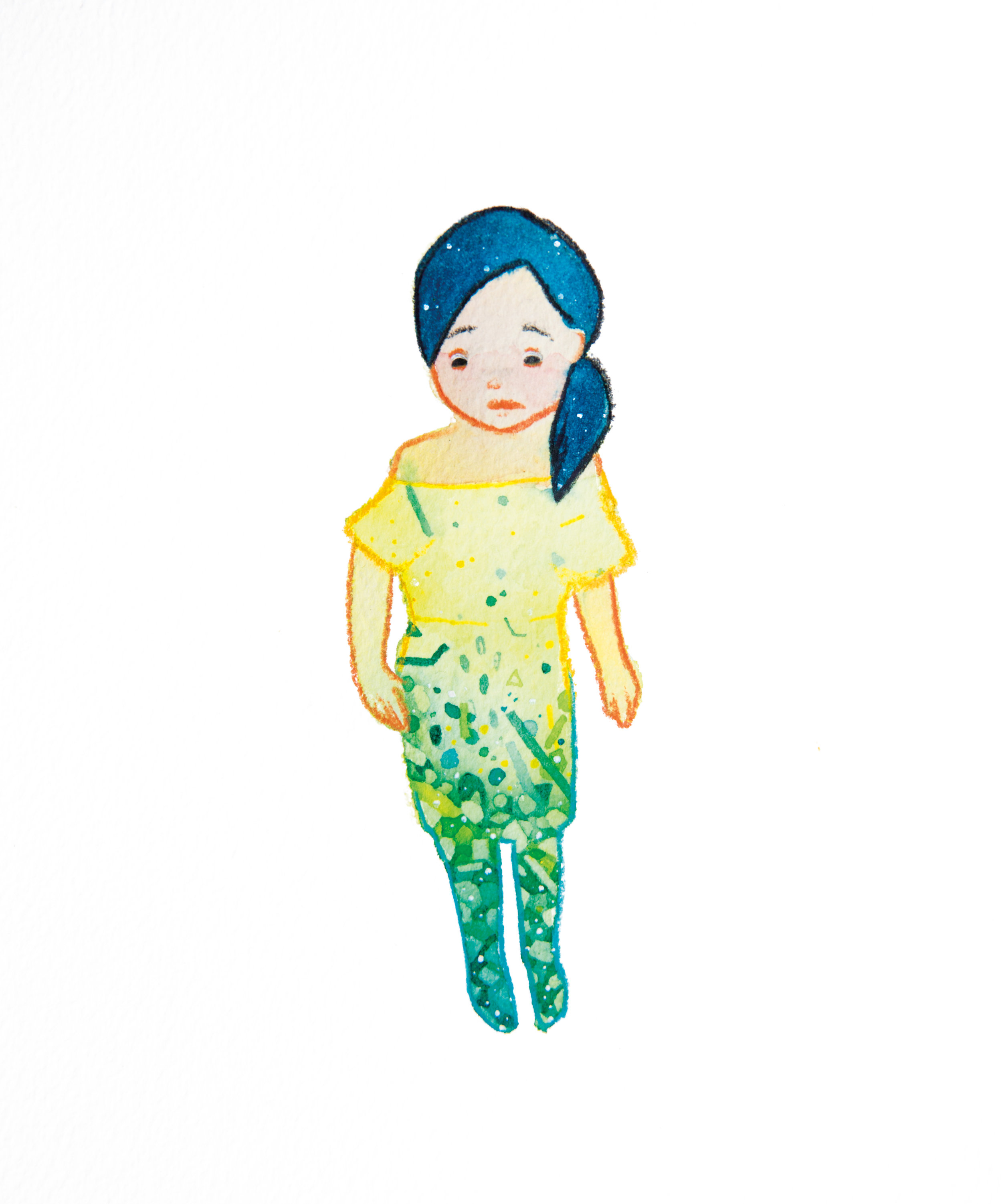
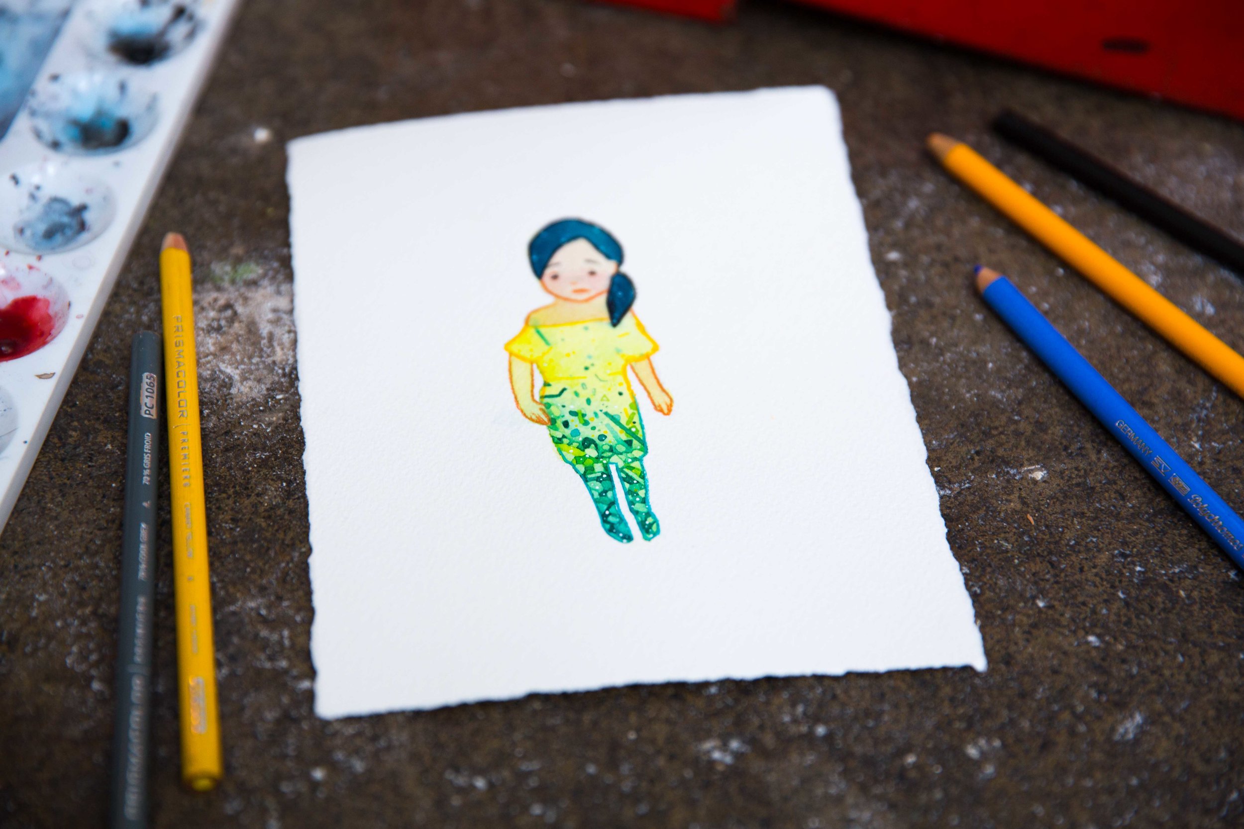
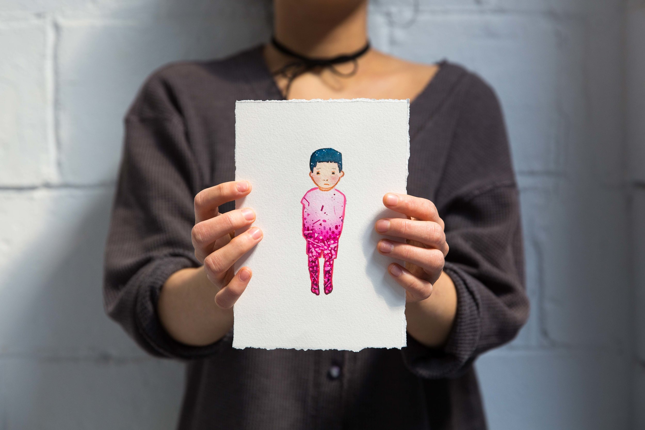
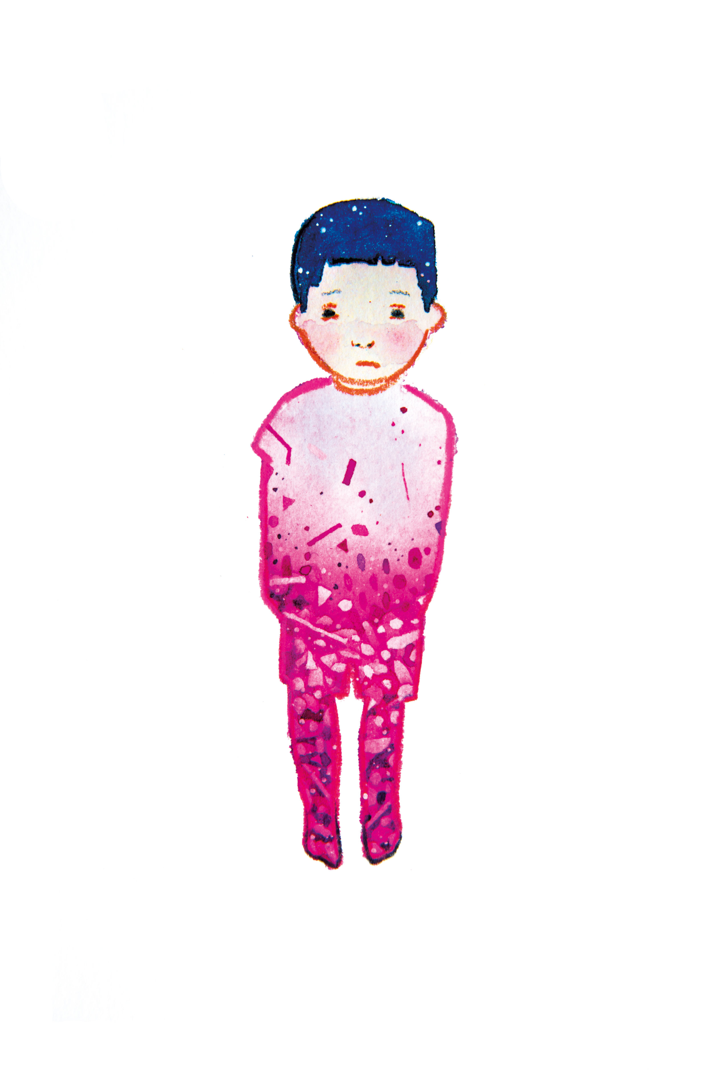
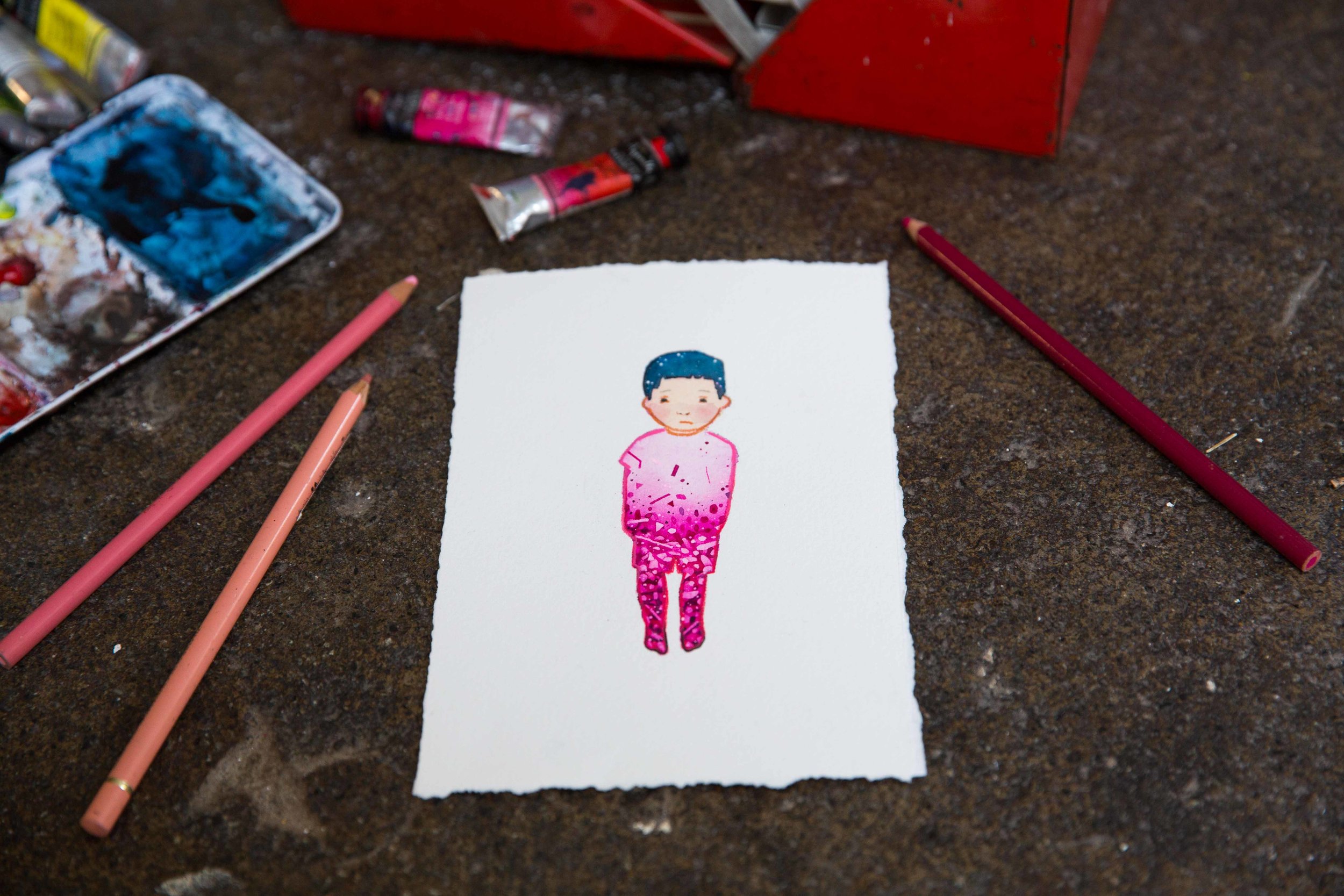
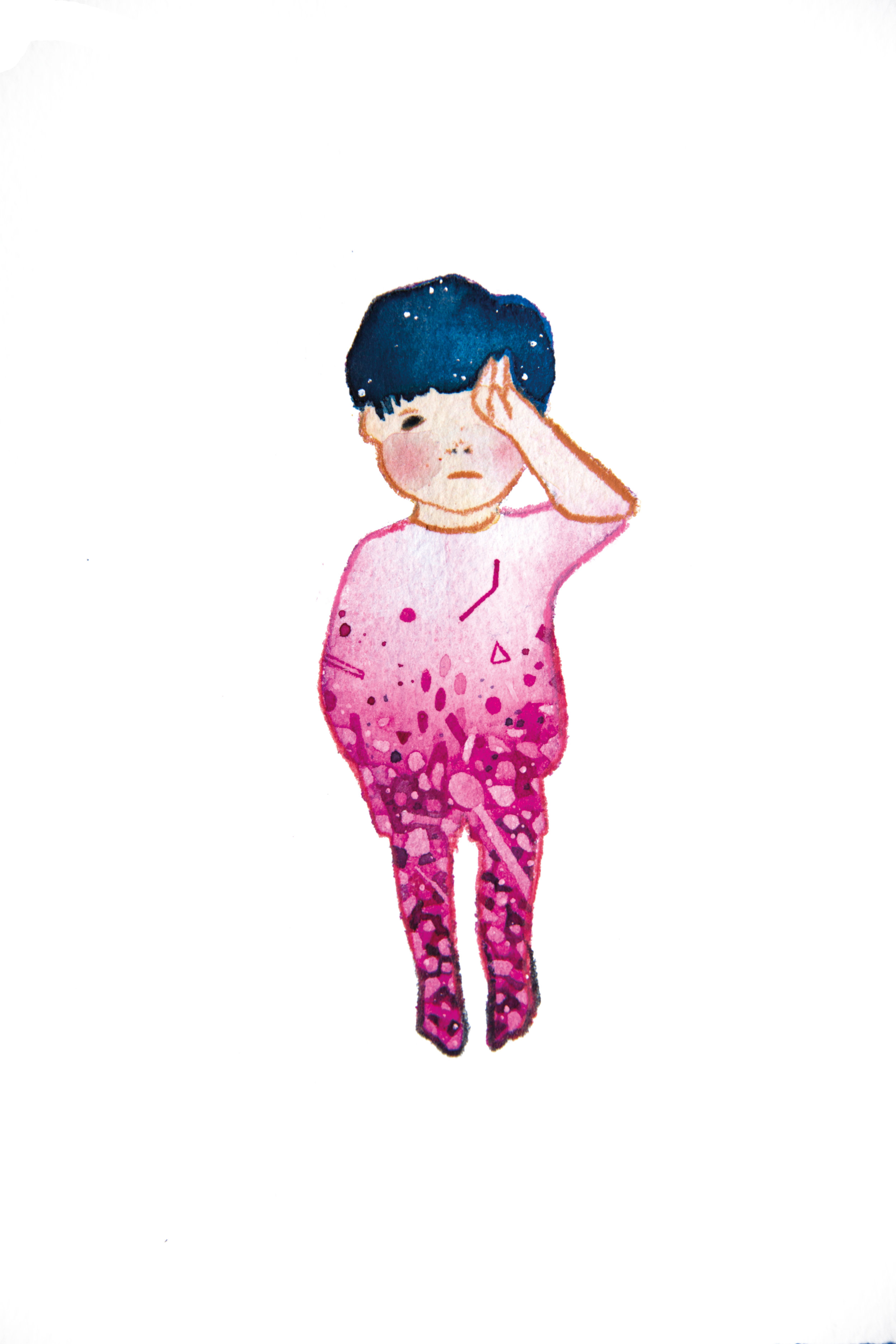
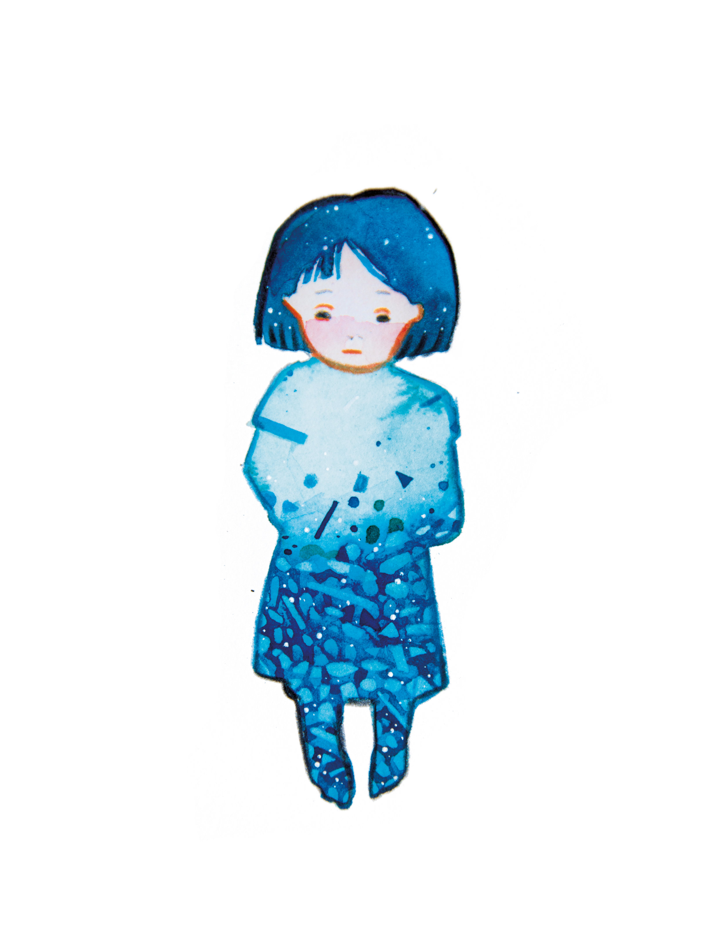
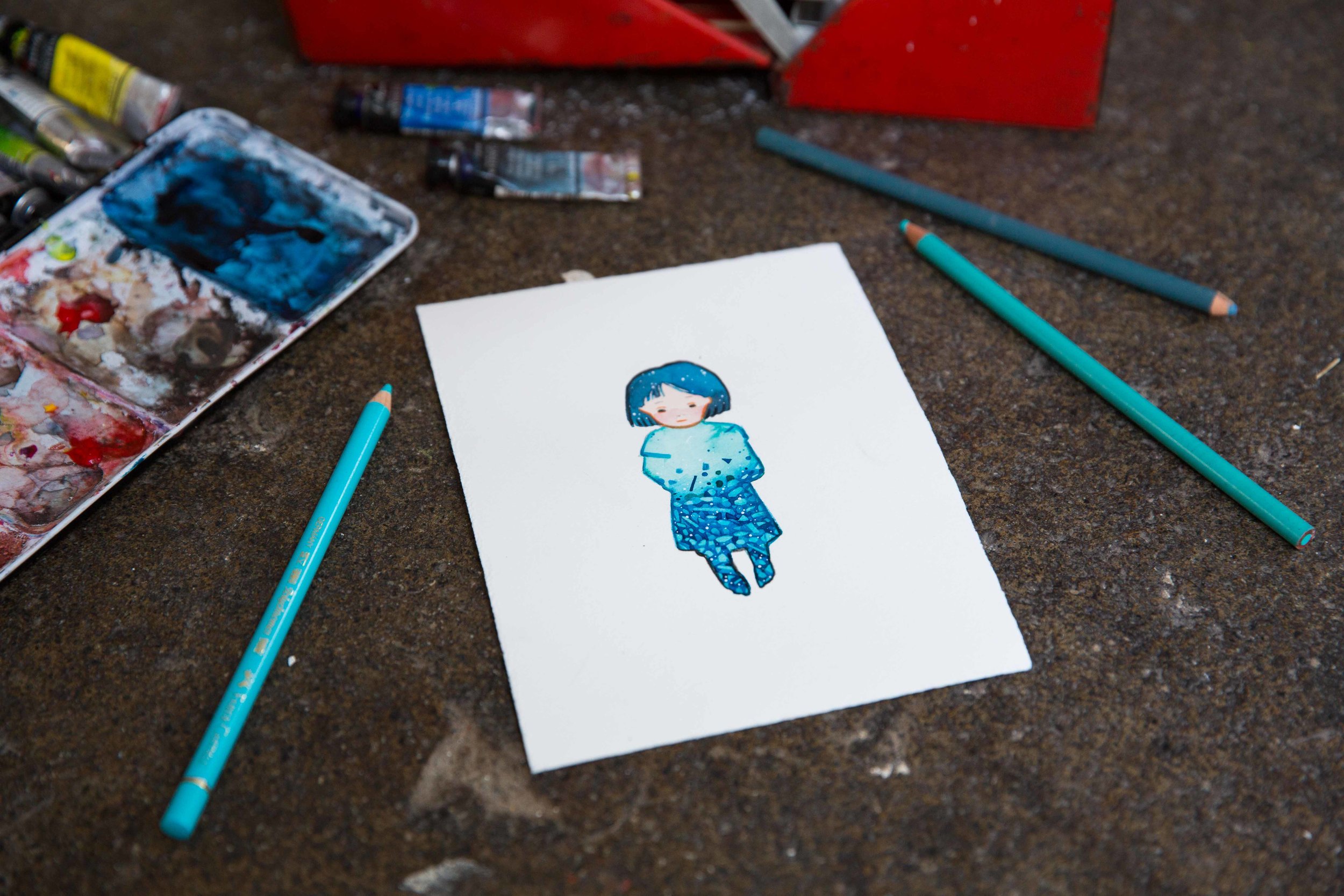
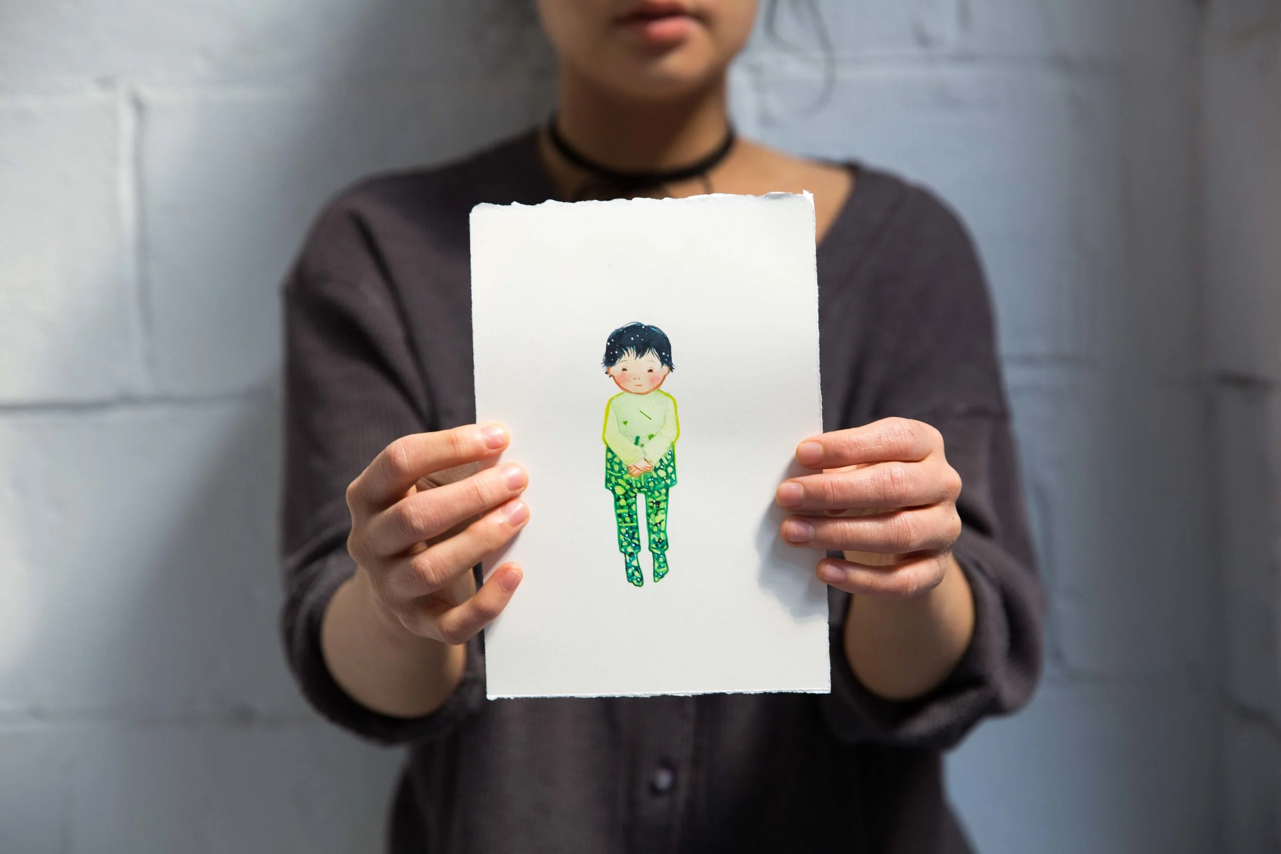
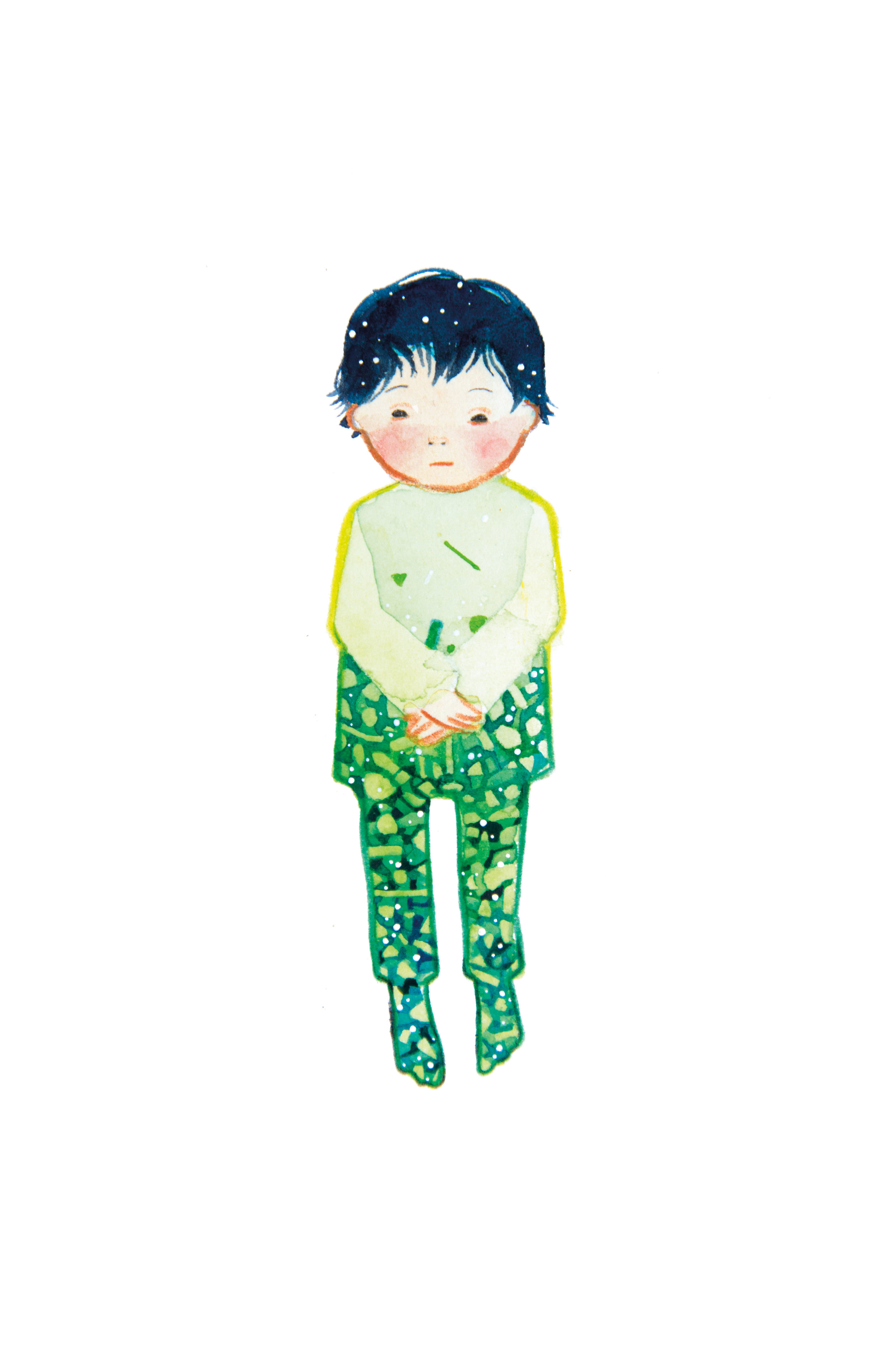
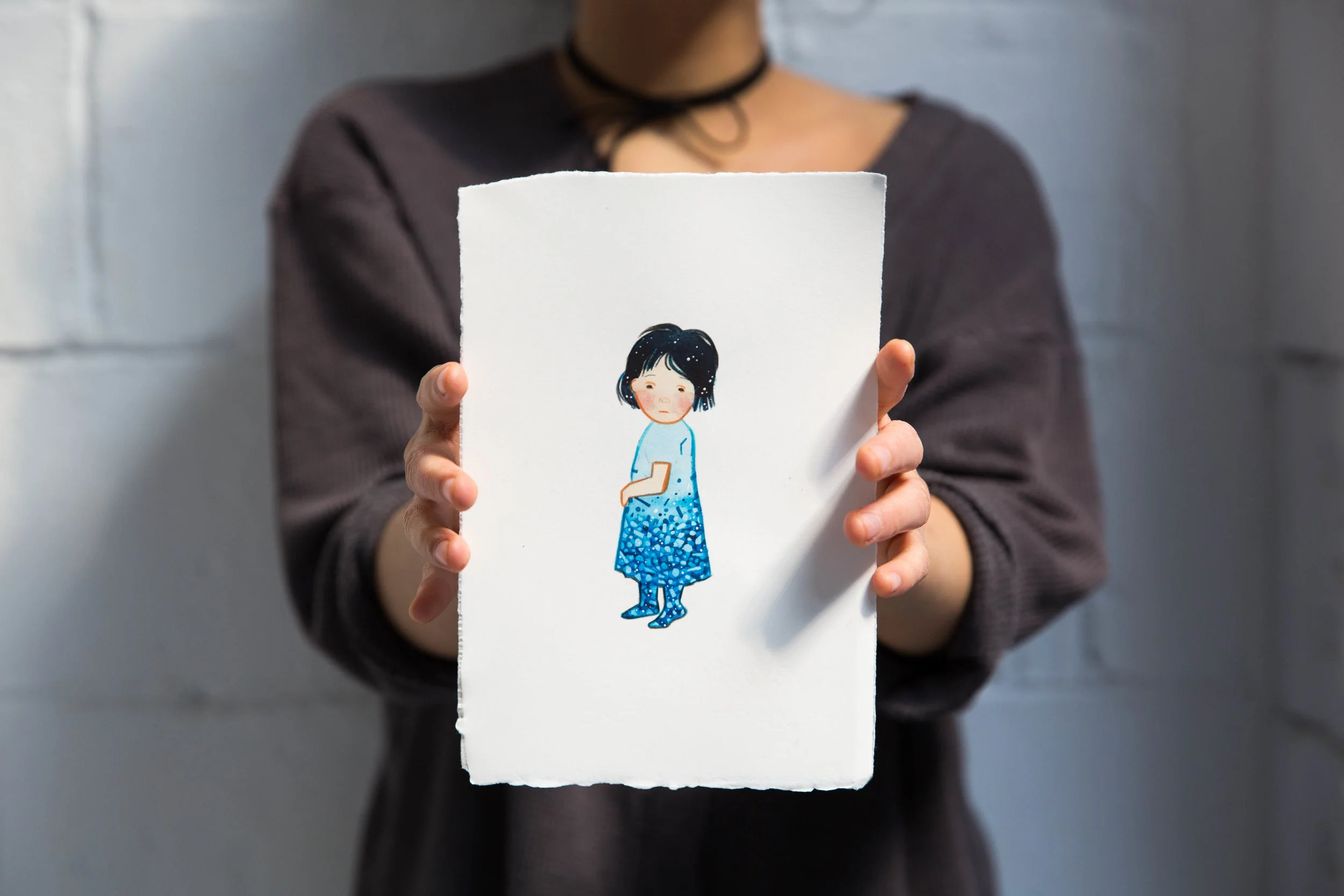
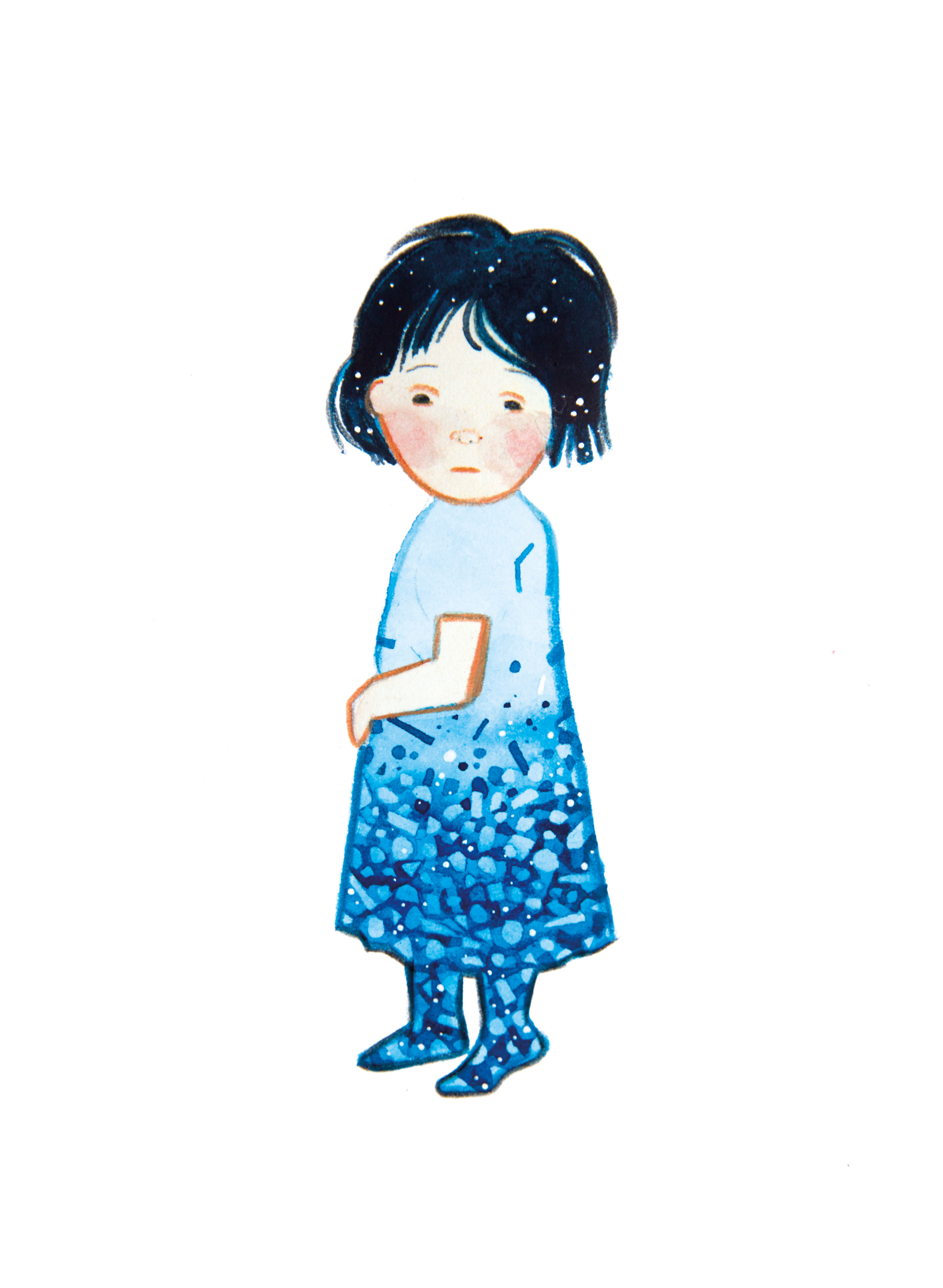
Each painting depicts a child, double exposed with fragments that represent the rubble of war. The fragments and particles scattered across the children's silhouettes fade from light to dark - the dark being the conflict, the displacement the disruption of many families lives and their livelihoods, and the brightness being a much simpler and happy future that could be. The purchase of one painting can feed a family for one month.

I am using this project to process my research and the events that have come to my attention throughout the year, and to help refugees in crisis. I hope to sell all the artworks to raise $1,960 AUD in total for this cause. Which may not sound like much but can mean a lot for refugees who's needs are as simple as food, hygiene and shelter. I will update this journal post every day with new paintings, which you can buy simply by emailing us at chris@furrylittlepeach.com - I will indicate which paintings have sold.
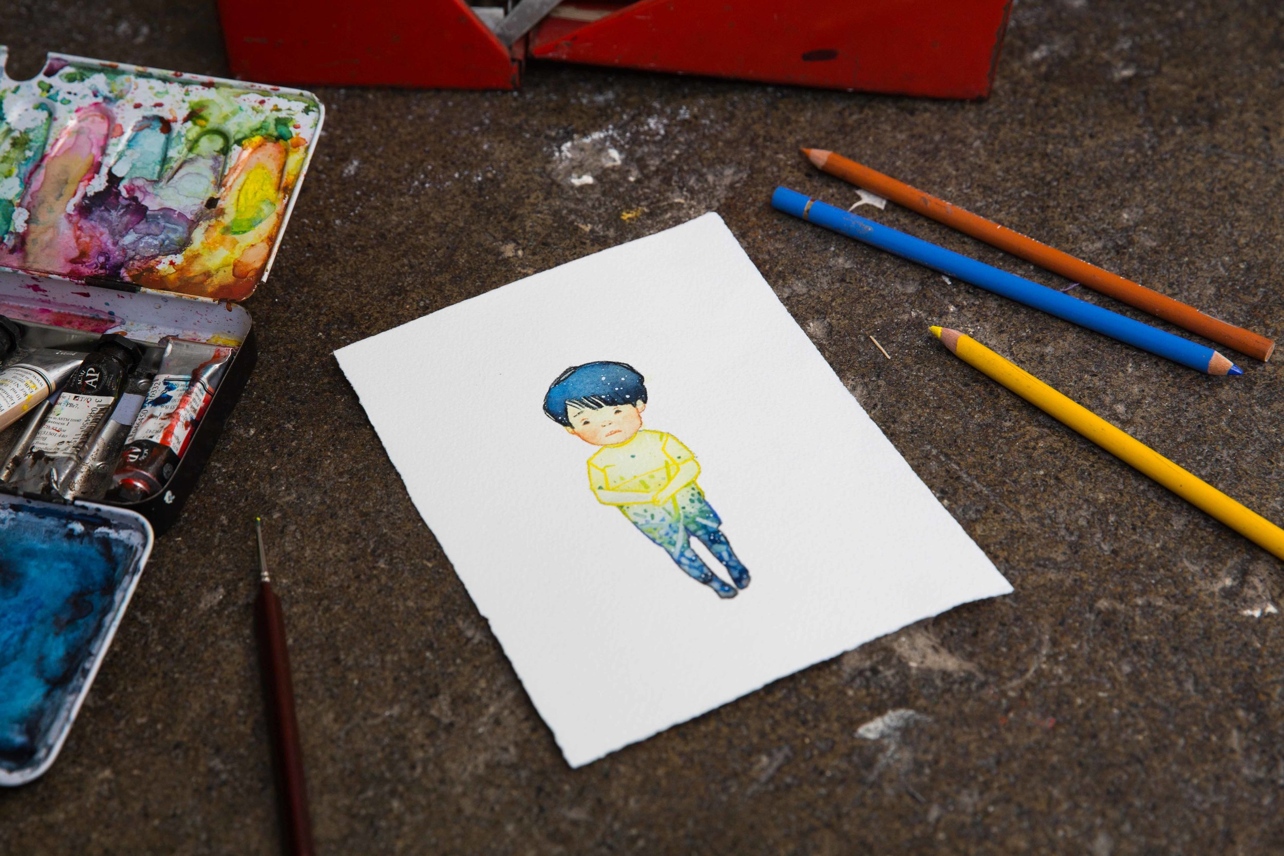
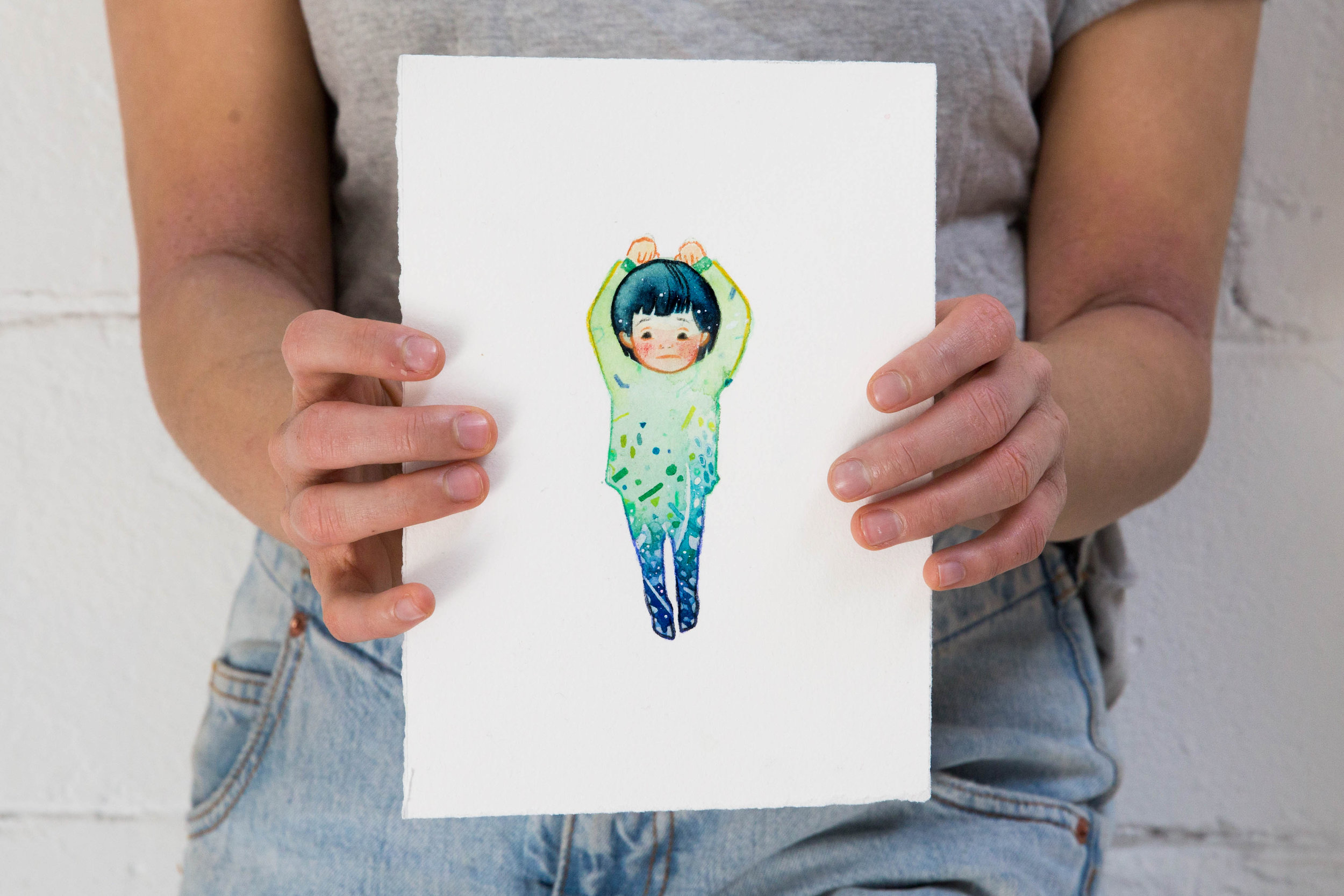
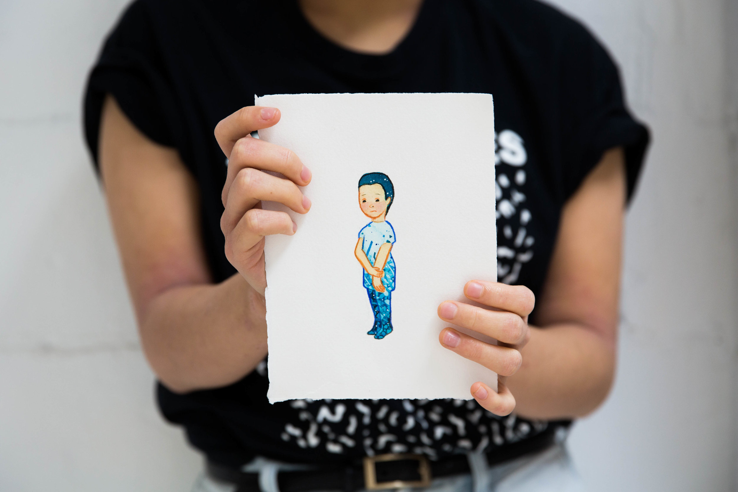
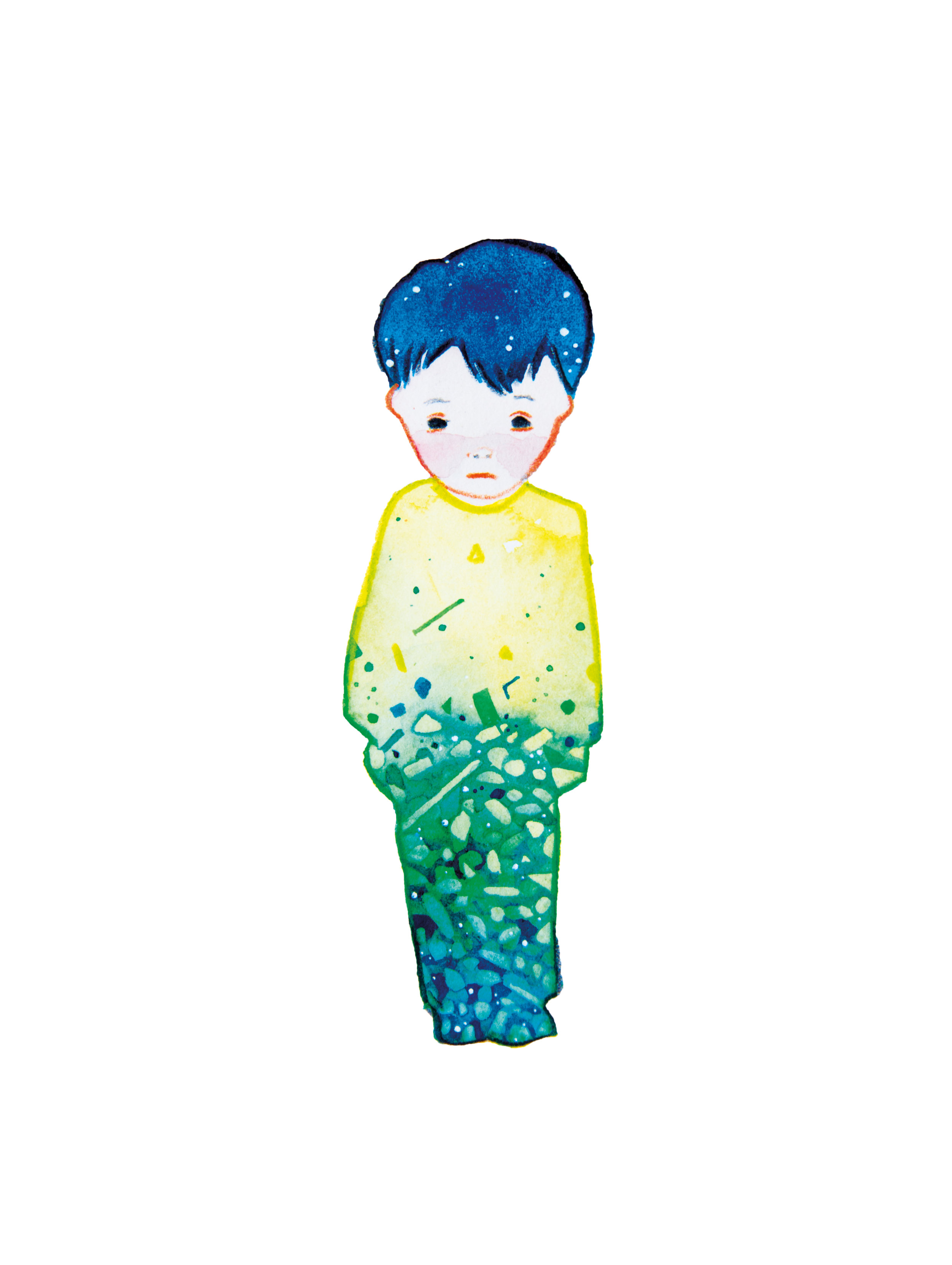
Fragment 01
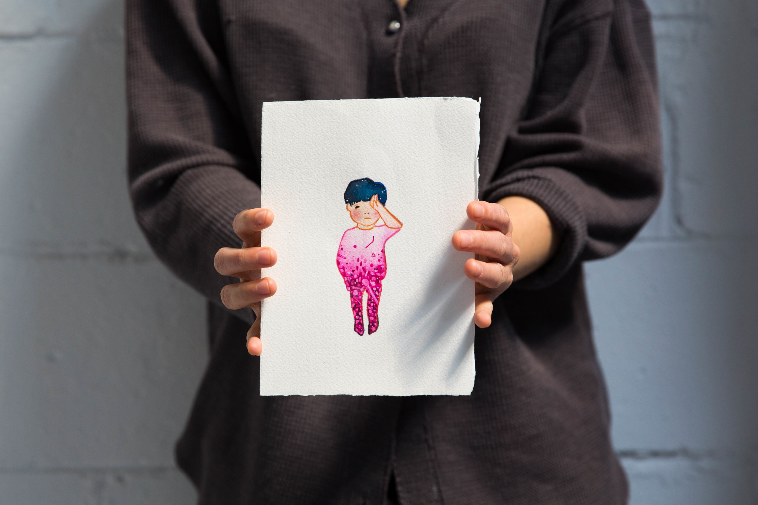
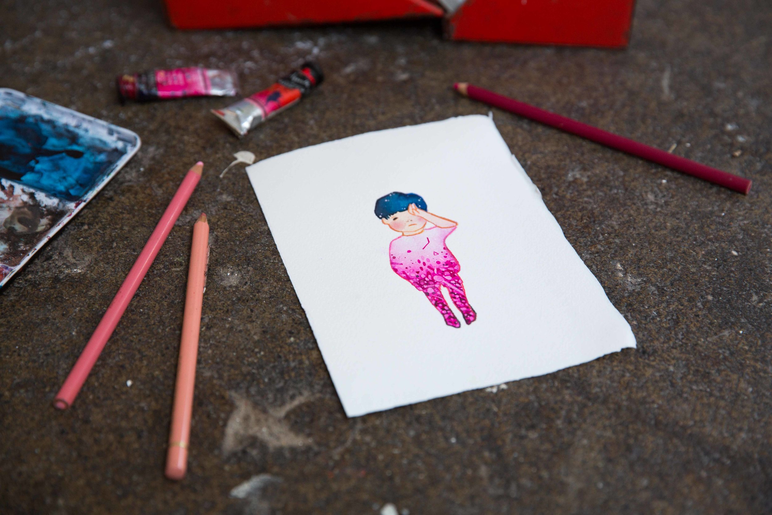
FRAGMENT 01 was inspired by Omran Daqneesh, the little boy who was filmed being pulled from the rubble and put into the back of an ambulance. Seeing the video of Omran prompted me to initiate this project.
FRAGMENT 02
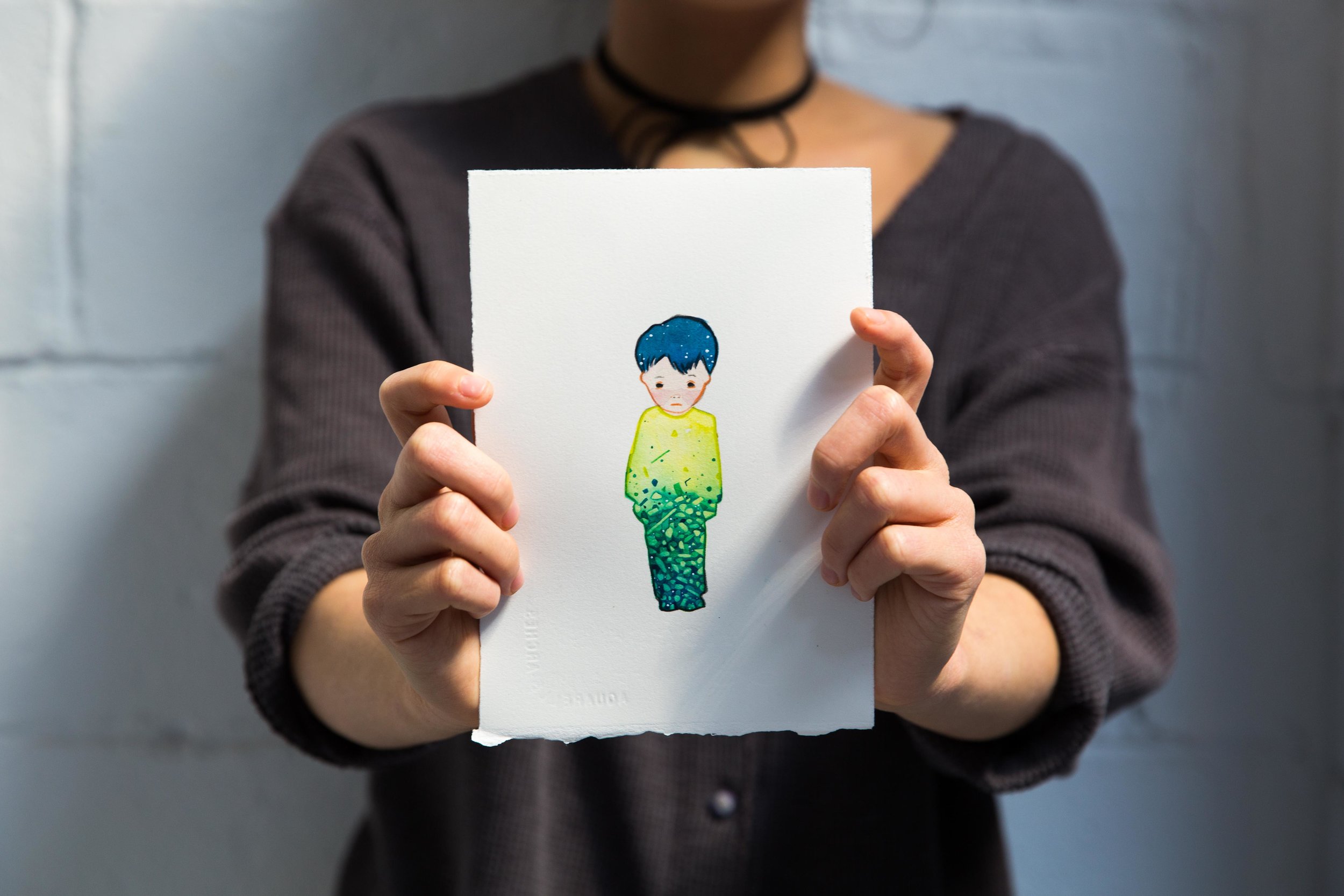
FRAGMENT 02 was inspired by Alan Kurdi (originally reported as 'Aylan Kurdi'), the little boy who was discovered dead, washed ashore on a Turkish beach after attempting to flee to Greece in a rubber boat.
FRAGMENT 03
FRAGMENT 03 was inspired by Adi Hudea a little girl who was photographed "surrendering" to a photojournalist because she mistook his camera for a gun. This piece was bought on reserve - if you'd like to reserve a piece in advance please email us at chris@furrylittlepeach.com
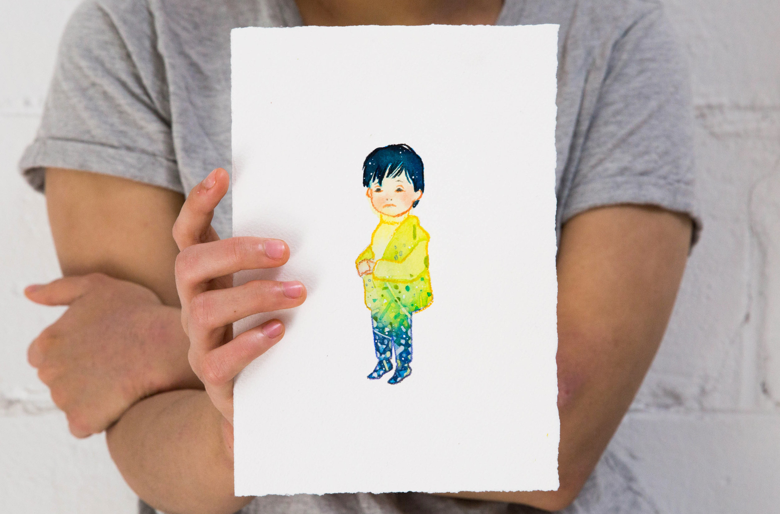
FRAGMENT 04
FRAGMENT 04 was inspired by an unnamed boy who was photographed sitting in a field hospital with head injuries, following an airstrike and shelling. This piece was bought on reserve - if you'd like to reserve a piece in advance please email us at chris@furrylittlepeach.com
FRAGMENT 05
FRAGMENT 05 was inspired by an Ghina Ahmad Wadi, a ten year old girl who was wounded by sniper fire in Madaya, Syrian government forces then blocked her evacuation to medical care. Ghina has now been evacuated to a nearby hospital. This piece was bought on reserve - if you'd like to reserve a piece in advance please email us at chris@furrylittlepeach.com
FRAGMENT 06
FRAGMENT 06 was inspired by an Ali Daqneesh. One week after the video of his little brother Omran made world-wide news, Ali was wounded by a collapsing wall, resulting in broken ribs, chest wounds, internal injuries and what ultimately his death as doctor's could not repair the damage to his kidneys and liver. This piece was bought on reserve - if you'd like to reserve a piece in advance please email us at chris@furrylittlepeach.com
FRAGMENT 07
FRAGMENT 07 was inspired by Ahmed Tadifi, a two year old boy who was alone when he was brought to hospital (the same hospital that treated Omran), like many children in the aftermath of an attack he was separated from his family. He underwent surgery for serious injuries to his groin, head, arm and leg. Ahmed did not survive.
FRAGMENT 08
FRAGMENT 08 was inspired by a young girl (unnamed) who was photographed injured and covered in a layer of dust, in a makeshift hospital.

FRAGMENT 09
FRAGMENT 09 was inspired by a boy named Mahmoud. Mahmoud was filmed alongside his brother Amar (who inspired FRAGMENT 10) as they arrived at a hospital in Aleppo. The camera captured their final goodbye to brother Muhammad who died in the course of the video. I can't describe how heartbreaking it was to watch, please watch the video here.
FRAGMENT 10
FRAGMENT 10 was inspired by a young boy named Amar. Amar was filmed alongside his brother Mahmoud (who inspired FRAGMENT 09) as they arrived at a hospital in Aleppo. The camera captured their final goodbye to brother Muhammad who died in the course of the video. I can't describe how heartbreaking it was to watch, please watch the video here.
FRAGMENT 11
FRAGMENT 11 was inspired by an internally displaced UNNAMED BOY who was photographed selling his belongings at a makeshift stand in the rubble of rural Damascus. It was around the point of seeing this image that I began to release that these children had lost an immense part of childhood and in it's place were the burdens of being thrust into adulthood by war.
FRAGMENT 12
FRAGMENT 12 was inspired by an UNNAMED GIRL who was photographed sitting in a pile of rubble in the South Syrian town of Moadamiya. This was one of the less-widely seen images, released in FRAGMENTS. It was a quiet moment amidst a space that had seen a huge amount of chaos, and it touched me.
FRAGMENT 13
FRAGMENT 13 was inspired by a young girl named ESRAA who was photographed with her arm around her little brother Waleed on the ground near a shelter for internally displaced persons. Esraa and Waleed have not been separated like many families in areas of conflict and have been given new, warm clothes. I chose this photo because there is a glimmer of positivity, even if only in relativity to the atrocities happening elsewhere in Syria.

FRAGMENT 14
FRAGMENT 14 was inspired by an UNNAMED GIRL who was photographed sitting in a hospital bed wearing a dress covered in the debris of her home. None of the photographs of her in this series of images show her crying, one harrowing image of her in particular shows her looking blankly and directly through the lens of the camera while the children around her sit in hospital beds staring into the distance.
UPDATES & AVAILABILITY
FRAGMENT 01 | 12 SEPT 2016 - SOLD
FRAGMENT 02 | 12 SEPT 2016 - SOLD
FRAGMENT 03 | 13 SEPT 2016 - SOLD
FRAGMENT 04 | 13 SEPT 2016 - SOLD
FRAGMENT 05 | 14 Sept 2016 - SOLD
FRAGMENT 06 | 14 Sept 2016 - SOLD
FRAGMENT 07 | 15 Sept 2016 - SOLD
FRAGMENT 08 | 15 Sept 2016 - SOLD
FRAGMENT 09 | 16 Sept 2016 - SOLD
FRAGMENT 10 | 16 Sept 2016 - SOLD
FRAGMENT 11 | 17 Sept 2016 - SOLD
FRAGMENT 12 | 17 Sept 2016 - SOLD
FRAGMENT 13 | 18 Sept 2016 - SOLD
FRAGMENT 14 | 18 Sept 2016 - SOLD
PROJECT CONCLUSION
This project was one of the most difficult I’ve ever undertaken.
Physically yes, I struggled at times creating 2 artworks a day on top of my usual workload, but the research that led to each piece shook me emotionally. I cried every single day of the project, spending hours of each day looking at photographs that had been released in the mainstream media of children suffering, dead, and who had accepted conflict as the norm, as well as hundreds of images that were deemed too much for the general public - released directly by journalists through Twitter and alternative sources of uncensored media. Of course the emotional discomfort I felt is nothing compared to what these people are experiencing every single day - some of them have never known anything else. 2.9 million in fact, have known nothing but war for their entire lives.
Call it purposeful and blissful ignorance, but I’ve always avoided exposing myself to news stories that revealed the inhumanity in humanity. I always worried, by seeing the abhorrent behaviour by individuals and governments alike which continues to happen across the globe, that my work would lose its charm - a separation from reality, it’s childlike innocence and it's playfulness.. And as I learned of countless stories from inside and the escape from the conflict, I woefully came to a realisation that was articulated by a quote I found later in my research:
“there are no children any more. Only small adults.” almost everything that constitutes a happy childhood has been ripped away from children by this 5-year civil war.
I’ve learnt a lot over the past week. I’ve read about of the horrors of war, I’ve seen death, disfiguration, mourning, desperation and helplessness - among people who are more similar to myself and those I love, than not. On a personal level I’ve been angry, felt helplessness and have realised that my work is not just a reflection of the world I keep in my head, but that it can be an optimistic view of a world I would like to live in.
I took still and moving images of children who were broken, who were injured and who are making the very best of the cards they have been dealt, and turned them into images of children who were free of suffering. Who stood in stillness. Who were saved from seeing and experiencing things many of us are lucky to have never seen or experienced. My aim wasn’t to sterilise these images for a wider audience, but to make a difference for myself and for others the only way I know how - through my work.
I wanted FRAGMENTS to be a reminder that every image or story we share for a moment, are fragments of lives that are stories too intricate to retell through an image (whether that be photography, video, or art). They are lives that are complex like ours, but that go on to live through a seemingly never ending war.
A huge thanks to those of you who bought a FRAGMENT from the series. Your contribution alone can buy a family food for one month, but together the funds donated to Care Australia can do the following:
Provide 93 women with hygiene kits
Feed 14 families for one month
Provide over 46 families with safe toilets
Provide safe accommodation for over 9 families
Thanks Again