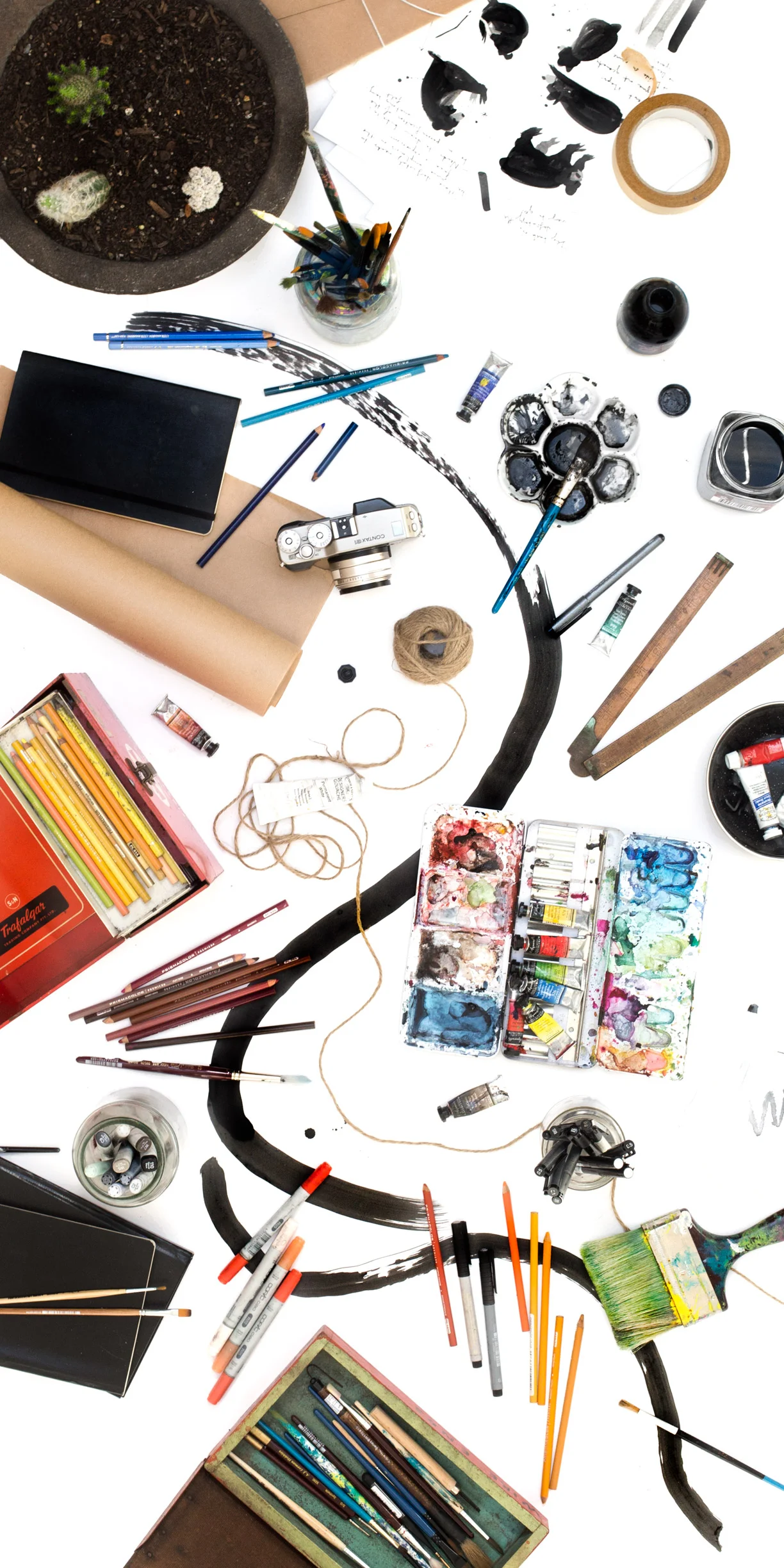
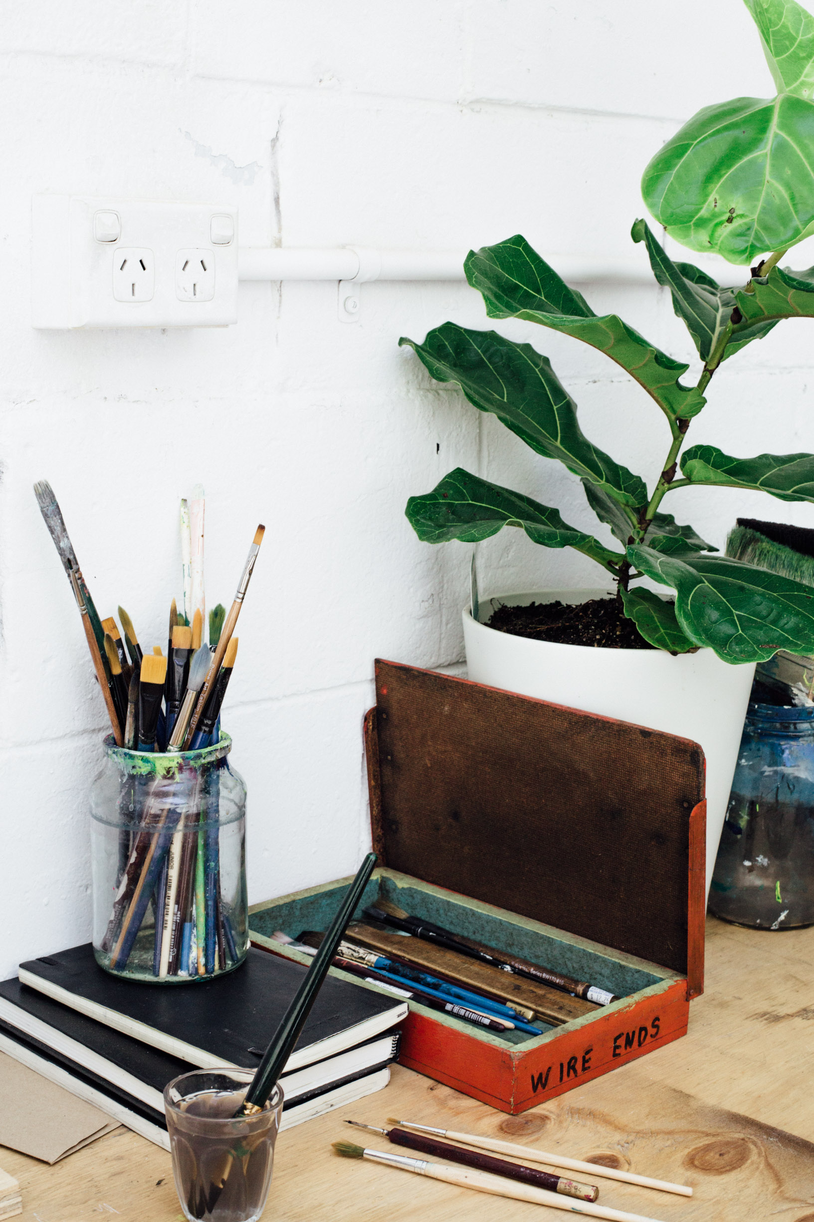
Bleep, I know it's been a while and while I had had well-wishes that it wouldn't be so long in-between journal entries, today I begin a long-awaited series which I've aptly named An Extensive List of Things. Part I is going to be a compilation of brands and materials that I use most in the studio, and will hopefully be useful to some of you out there in internet-land.
I want to preface this journal entry by explicitly stating that it is not all about the brands, materials, and products you use. What's most important is practice, practice, practice, and while some materials may produce better results, if you have no idea what you're doing there's no point in spending hundreds of dollars on something you're essentially practicing on if you can use something a hell-of-a-lot cheaper. Think of it like this: you've bought some brand, spankin' new & expensive activewear, just to run a marathon you haven't even trained for.
I don't propel my body into motion on purpose or on the regular, nor do I own activewear but I can safely say I've been experimenting and working with different brands and materials for the entirety of my career, and through this process I've learnt countless valuable things about myself as a creative and what works best for me when crafting my work.
Before I get rid of this nasally, lecture-y voice, I just want to reiterate (out of love) that while it's fine for you to be curious about how your favourite creatives do what they do, that should not shear off any the time you spend trying things out for yourself. Okay, mum-voice off - I'm ready. You ready?
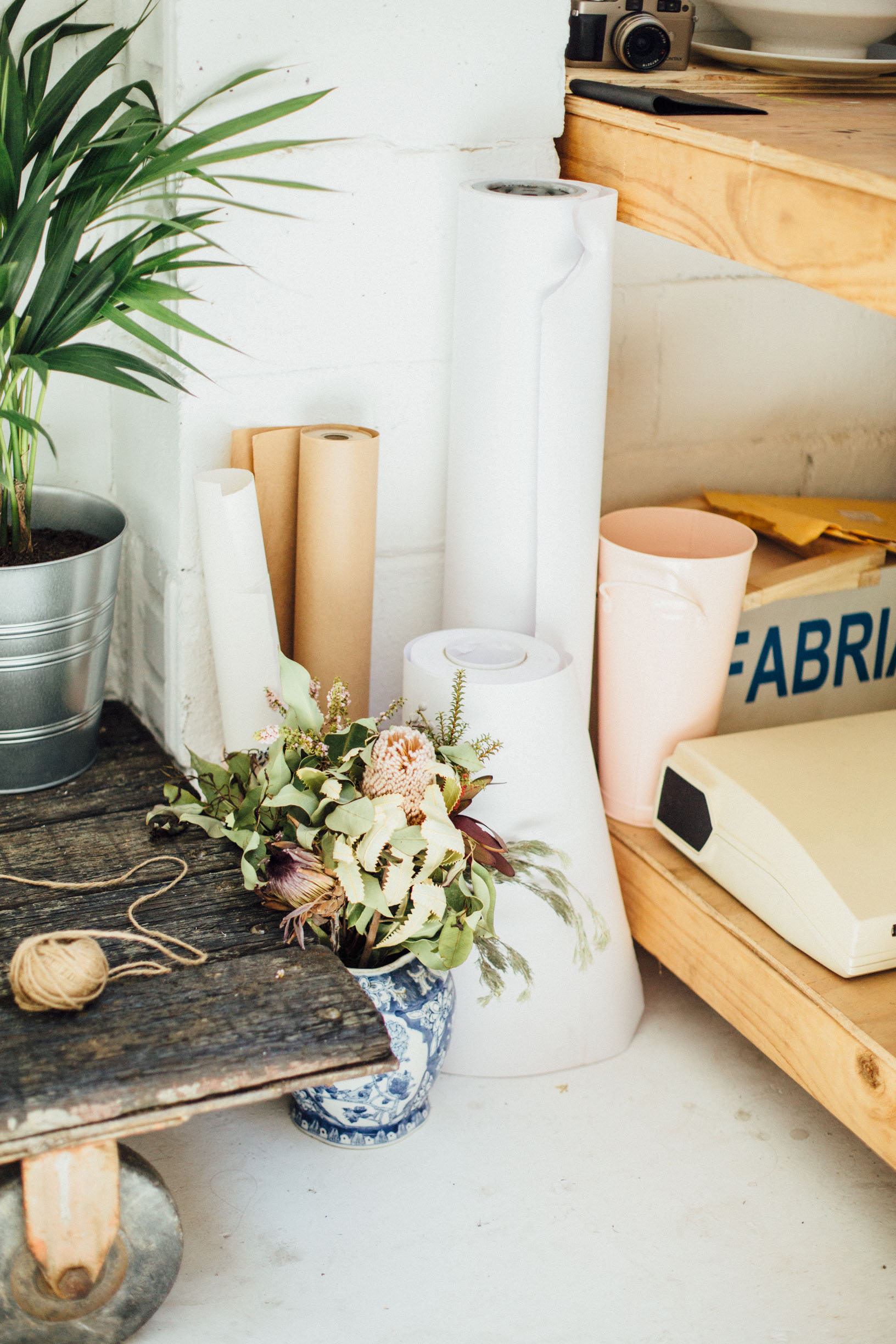
PAPER
Paper is by far one of the most important things I spend my $$$ on, and probably where I spend the majority of it because I go through it so quickly. Over the years, through very loose loyalty, I've bought, tried, tested, loved & hated a dozen different brands, but found a taste for the more expensive stuff. I'll also include my most frequented cheaper papers too because I do use them often and there will always be a place for it in my studio.
Arches 640gsm Watercolour Paper (Cold-Pressed)
Arches is a brand that I've used for years, not just because of it's availability at all of my art supplies stores, but because their paper is really great quality, made with 100% cotton fibres (according to wikipedia, each percentage point is equivelent to one year of deterioration resistance), and they're available in a huge range of weights and textures - whatever your style or medium, I can assure you there is an Arches watercolour paper that will work for you.
I have tested all the weights available to me (I started really light), but as my pieces got larger and larger I started using the 640gsm stuff and found that this. This. Is my stuff. So much so that I recently spent about $800 on a 10m x as-tall-as-me roll of the Fabriano equivalent. While my staple single sheets don't reach the hundreds, they add up with a single sheet costing around $25. As I mentioned they have a huge range of different weights so if you're unsure whether you need something so heavy go with the cheaper options first - I still use 300gsm for smaller paintings and for artworks I plan to scale into bigger pieces.

Canson 185gsm Aquarelle Paper
This was the brand I started using back in 2010 when I tried watercolour for the first time. While I wouldn't use it now for a painting, at the time it served it's purpose (it came in booklets of 100 for around $35) and I still use it for sketching and quick watercolour studies.

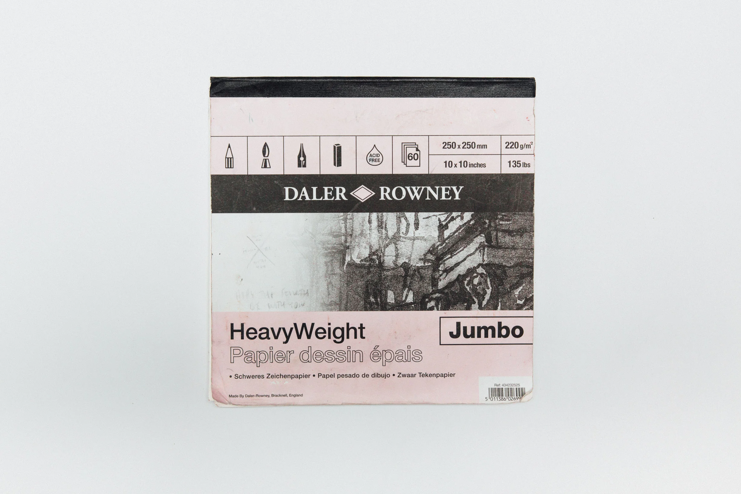
Daler Rowney HeavyWeight Drawing Paper
This is a small tear-away booklet (250mmx250mm) at 220gsm, and is awesome for most drawing mediums. I often get asked what paper is best for Copic Markers (which tend to bleed across and through pages), and this would be my favourite.
Tracing Paper
Tracing paper isn't something I use very often, but it is something that I've needed from time to time whether it's refining sketches before upscaling them into paintings, or working on the initial stages of design projects (handy for when going through client feedback and making amends to sketches you're already happy with). I don't use it enough to have preference, but the pad sitting in my studio at the moment is 50 sheets of 110gsm. You couldn't use this stuff for water-based liquid mediums (many pens, inks, watercolours), due to the waxiness of the paper anything water-based will be repelled and end up in tiny puddles only slightly resembling what you originally envisioned.

BRUSHES
When it comes to brushes, I'm not loyal to any brands. I own anything from the cheapest synthetic brush picked up last-minute at an office-supplies store, to an expensive watercolour brush with natural fibres and materials which they no longer make anymore. When I am buying a new brush I will go by my past experience as well as how the brushes feel rather than which is most-expensive, or which brand is said to be the best. In this section: I've included accompanying gifs so you can see how differently each brush fills and creates strokes, I'm referring to and speaking about the brushes I use for liquid mediums (and not things like acrylic or oils), and I'm also going to focus on the types of brushes I use, and less so on the brands.
Round Brush
This is my go to - my most-used brush by far - and that's because round brushes are incredibly versatile. The round brushes I own are bulbous for the most part, but then taper into a soft point - this means I can get a huge range of different line-weights simply by varying pressure. I often buy synthetic for these because I find them to be a lot softer and more durable (which is important in maintaining the neatness of the fibres and that soft point at the end).
Another great thing about these brushes (a list that seems to be never-ending), is that because they have such volume to them, the fibres hold water and pigment really well which is essential for me because I don't want to have to reapply paint with every stroke. If you work with watercolour and/or ink, I would definitely give this type of brush a go if you haven't already.


Flat Brush
I use these babies quite infrequently however they do come in handy. Where the round brush lacks in stability/firmness the flat brush rushes in to pick up the slacl. You may have seen me use one recently in the painted-sketch of the red-head and the fox - this snippet is the perfect example of what I would use the flat brush for: for filling in blocks of colour which require sharp and bold edges.
I would not recommend using this brush if you're trying to blend different colours together because the motion in which you blend a liquid medium is looser, and the firmness/straightness of the flat brush bristles (the ones I own are quite short) mean that paint can splatter across your page - not ideal if, like me, you use a lot of negative white space.


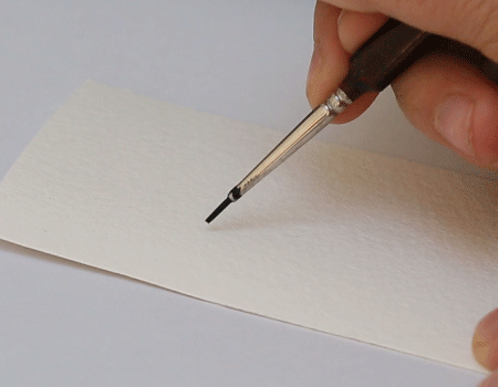
A.J. Leeman Hobbies Synthetik Sable Brush
This next brush is a little tough. I don't know much about the brand, and they don't have much of a background - at least not online. I've tried researching them before because I thought the brandname sounded so hilarious and from what I found, A.J Leeman Hobbies just seems to be an Australian hobby company who also happen make brushes (maybe for painting figurines?). Either way, I love this brush - I primarily use it for outlining artworks in watercolour and in gouache, the tiny tip (Size 3/0) is both short and thin which means even with a lot of pressure the stroke isn't more than a couple of millimeters in width. See me use it for filling in colour at the beginning of this snippet from my Snapchat story for a miniature bat painting.
Another nice little feature that I really appreciate is the triangular handle, which means when you set the brush down it A. doesn't roll away (onto your painting or otherwise), and B. it lifts the end of the brush off of the surface you're working on. Anything that reduces my mess is a tick in my books. I only randomly stumbled upon this brush in a small-ish local art/craft/book shop - so I'm not sure how easy they are to get your hands on.

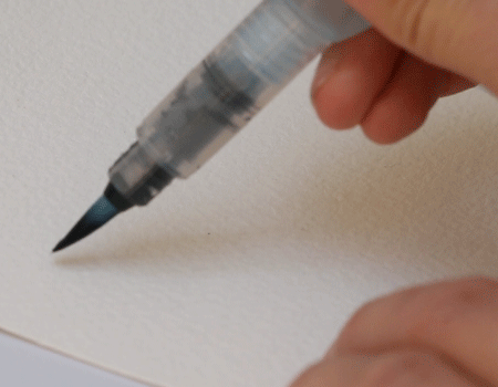
Pentel Aquash Water Brush
This is brands start to come into it (because I only own one of these). I picked this Pentel Water Brush up in Portland on our trip to the US/Canada earlier in the year - I wanted to paint in the car and having a jar of water in the cupholder next to me was not an option when driving through the Canadian Rocky Mountains. I've yet to use this on a real-life painting so my opinion on this brush isn't as fully-formed as the others but it's great for not having to reapply pigment your brush often, and it's great for creating harmonious colour palettes because while painting your brush strokes will go from a dark, rich colour to a soft wash.
In the past I've picked up similar pens and filled them with ink, and I've heard of other artists, illustrators and letterers doing the same, however I would rather buy a black brush pen than do this because the ink (at least the stuff I use) dries up and makes the pen virtually unusable.

WATERCOLOUR
I've always been interested in art, ever since I was a tiny, little version of who I am now, but it wasn't until I started using watercolour in 2010 did I really find a medium that allowed me to most accurately depict what was going on in my head. There is so much I love about this medium: the way it moves across the paper, the low impact it has both on the environment and my sensitive skin, the process of mixing and layering and the way it has become an extension of my fingertips. I have a lot to say about it, but I will try to keep it a reasonable length similar to the other materials mentioned above, for consistency's sake if nothing else.
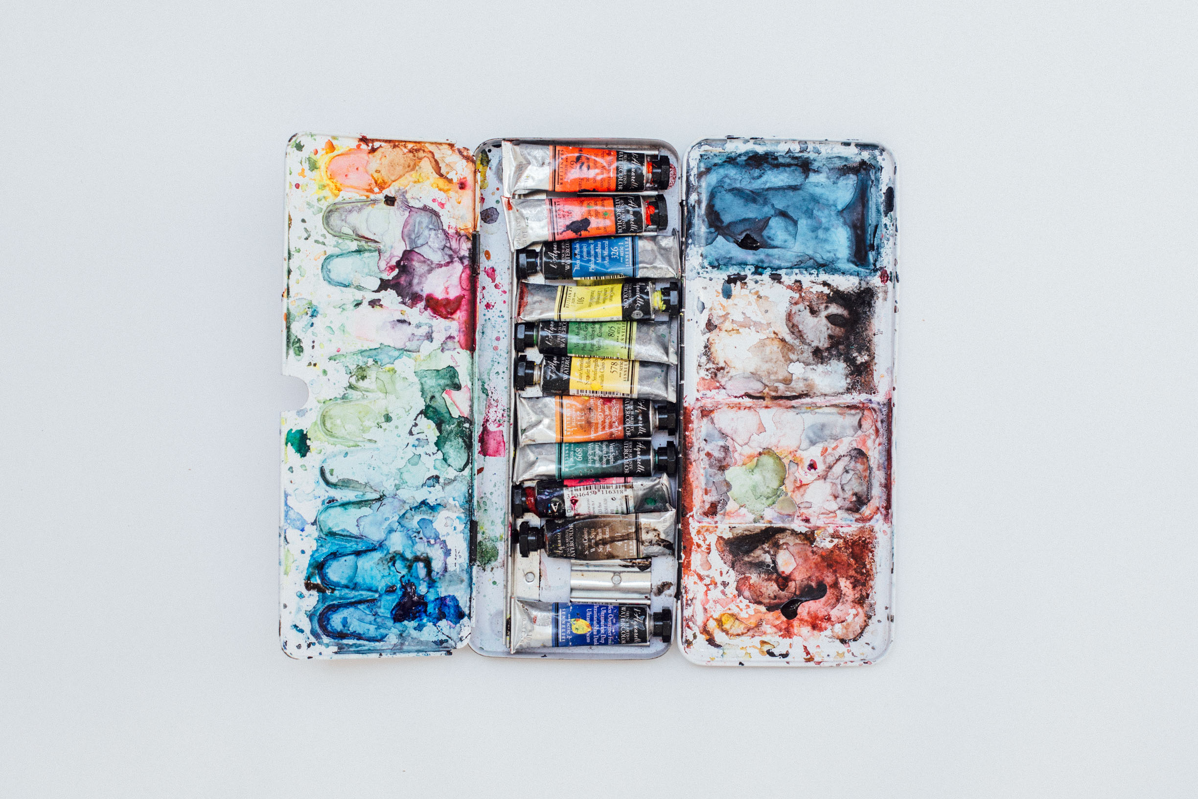
Sennelier French Artists' Watercolour Tubes
Rocket surprised me with this twelve tube set for my 21st birthday, although I've had other sets briefly in between but I still feel like that's an incredible amount of time to have one set of paints (I'm not even close to finishing any of the colours). I had never used nor heard of Sennelier before I got them, but I'm so glad I did because they've been my favourite thus far.
Some interesting things about Sennelier French Artist watercolours: they mimic the colours used by French watercolourists and have hundreds of colours to choose from, another (and one of my favourite) fun facts about this product is that they use honey as a sort of preservative which makes the paint really smooth, and the drying time a little slower - perfect for bleeding and blending.
I would definitely recommend these to creatives everywhere, but if you're starting out and you don't want to spend hundreds of dollars on paints you could also try brands like Windsor & Newton who offer a range of student watercolours (which actually aren't so bad).
Schminke Travel Tin
I call it a travel tin, but really it's the Schminke 12 Half-Pan Watercolour Set in the Aluminium Tin. I picked up this adorable tin in Singapore when I was there last and it served me well as a travel set - it's compact, and having panned pigment means there's no risk of the tubes bursting due to plane air pressure - things are a lot less messy.
In short I prefer wet watercolour but I like to have a cheaper panned travel set that I can throw into my bag when I travel just in case (because it's for certain) that I'll get that creative itch while I'm away. I'll save my panned (dry) vs tubed (wet) watercolour debate for another post.
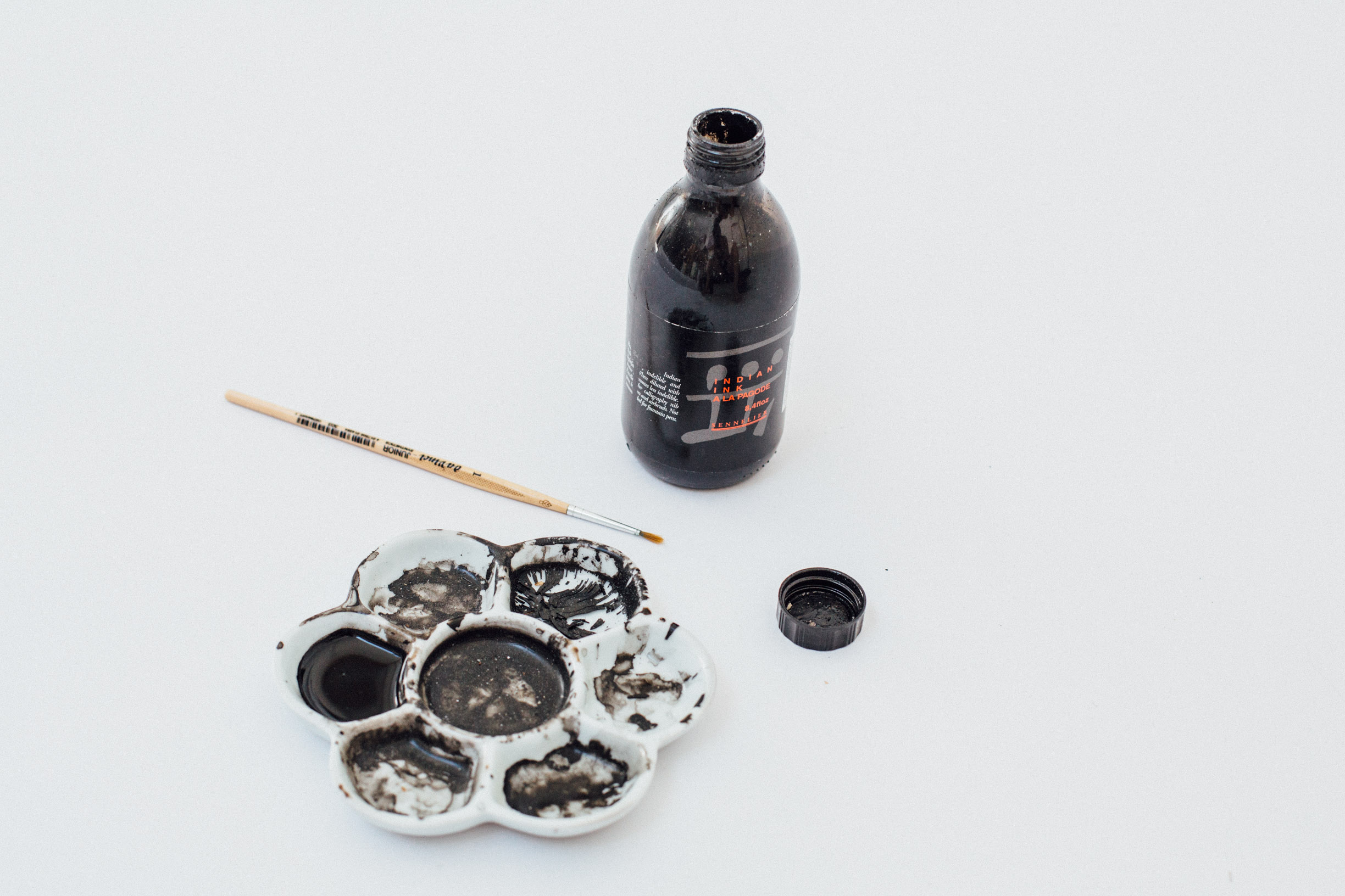
INK
Ink is one of those mediums where the difference between good and bad can have huge consequences. When deciding what kind of ink to use you need to ask yourself, is it a fine artwork? Is it a commercial job? What do I want from this ink? What am I looking for? The reason why you need to ask these questions is because you need to decide how much permanence your project requires. It's okay to use cheap and nasty ink on a commercial job if the output is something other than the original work whether it be something you're designing to be printed, or something that you're going to digitise for life on screen. However if the final output is the artwork itself - for say, a show or a commission - you need to ask yourself how much longevity you're willing to sacrifice.
The blue ink I used in my last journal entry by Winsor & Newton looked really awesome, and as blue as it is on screen, but it wasn't light-fast. After sitting in my studio for a couple of weeks, the blues began to fade and the colour went from being a vibrant Ultramarine to more of a faded Purple-Indigo (granted I was also using a paper I haven't used before, so it could be a combination). The bottle will usually tell whether or not your ink is waterproof, lightproof as well as any other useful information, but it's also good to do your own test it if you want to make sure it's going to stand the test of time.

Sennelier Ink
I can't remember which project I originally purchased this particular bottle of ink for, but I remember buying it because of my positive experience with the Sennelier watercolours and I have no complaints so far. It's a nice warm, deep black, seems to be waterproof when layering, doesn't seem to leave obvious paint-strokes or streaks like a lot of black inks, and is lightfast. If I had to call it out for one thing, it would be that (in the dry Australian climate especially) it dries pretty fast - which can be great in some instances, but not if you're working from a palette like I do.
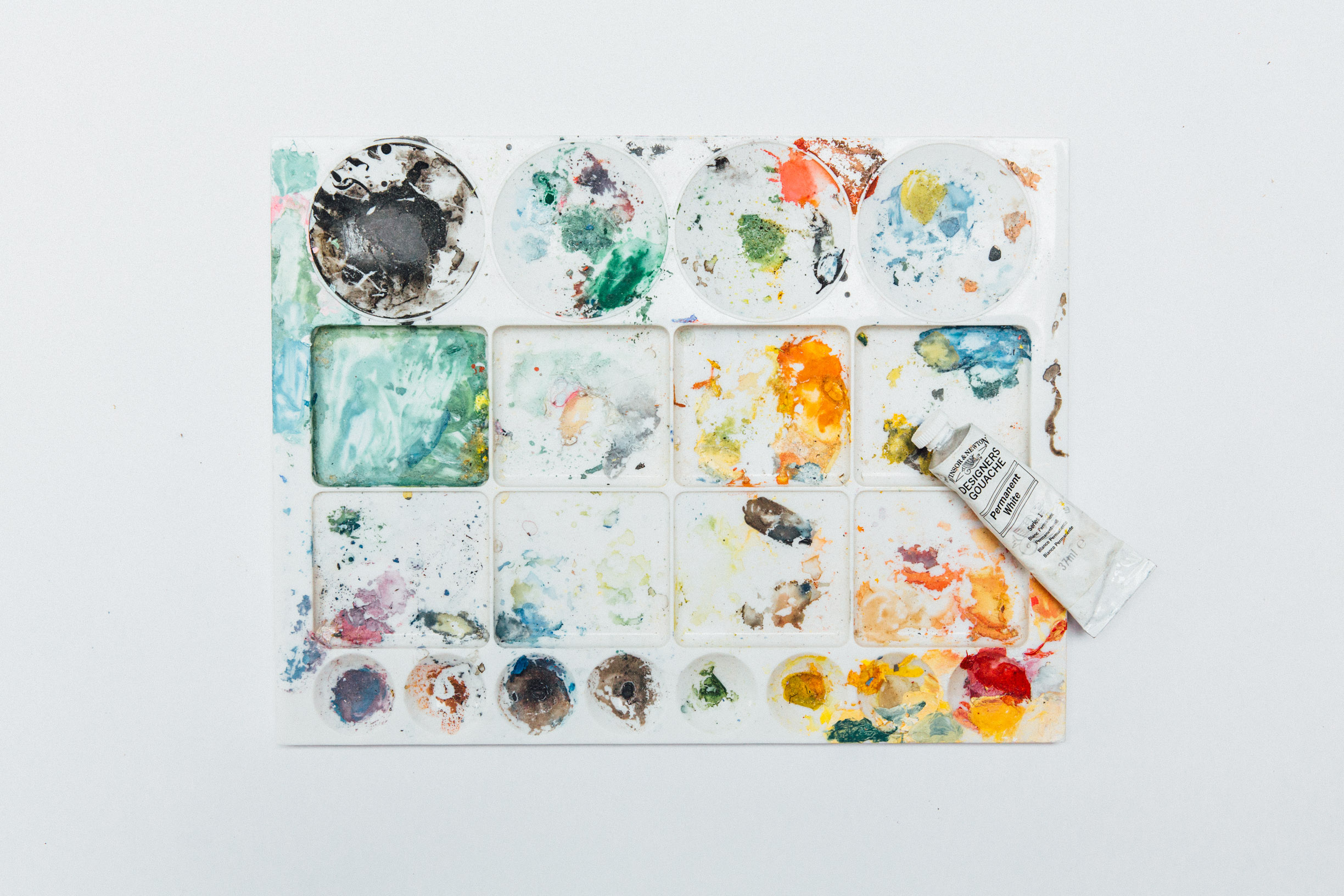
GOUACHE
Gouache is a lovely water-based paint which I like to describe as a happy medium between watercolour and acrylic. The reason I say this is because it's a bold and vibrant medium that will mask whatever is underneath it, but water it down or create a wash and it starts to act more like watercolour. It's something that I use to create fine outlines or for detailing, but it of course has many other uses.
Winsor & Newton Artist Gouache
I usually go with Winsor & Newton when I have very little knowledge about a medium, just because they're readily available at virtually every art supplies store, and generally has a good track record when it comes to the price and quality. I have no complaints when it comes to this produce, but as I said I only use it for outlining and detailing so I can't comment on the flatness and levelling of tis particular brand. I often mix gouache with a touch of watercolour because I don't use it enough to justify buying a huge range of colours (ie. for stinginess more so than a technical decision), and I have no complaints with it's ability in mixing media.
PENCILS
Traces of pencils aren't often found in my final artwork - I'll use them occasionally for detailing, and any graphite I use to construct images is quickly erased after a couple of layers of watercolour. Regardless of the seemingly elusive and mysterious nature of this medium to my practice, I actually use pencils a lot. If you follow me on any of my social channels you'll know how heavy the backend of my process is - I will do a number of studies and sketches before I even begin to think about putting paint to paper. The reason being, I want to feel confident that I can translate what's going on in my head into an artwork, and in order to do so I need to work out any kinks in how I'm able to articulate form and wrangle any loose ideas.
Graphite
This is another example of brands taking a backseat - I'm not loyal to any graphite pencil brands, I'm loyal to the softness of the pencil. I like to use anywhere from a 2B up to a 6B or 8B. A variation in line and darkness is really easy with a softer pencil and allows you to physically commit less to lines which for me means sketches will be more gestural and emotive. The graphite I use either comes in the traditional wooden pencil form, or in a solid graphite pencil which is great for shading but can be super messy, especially when you drag your ape-hands across the paper like I do.
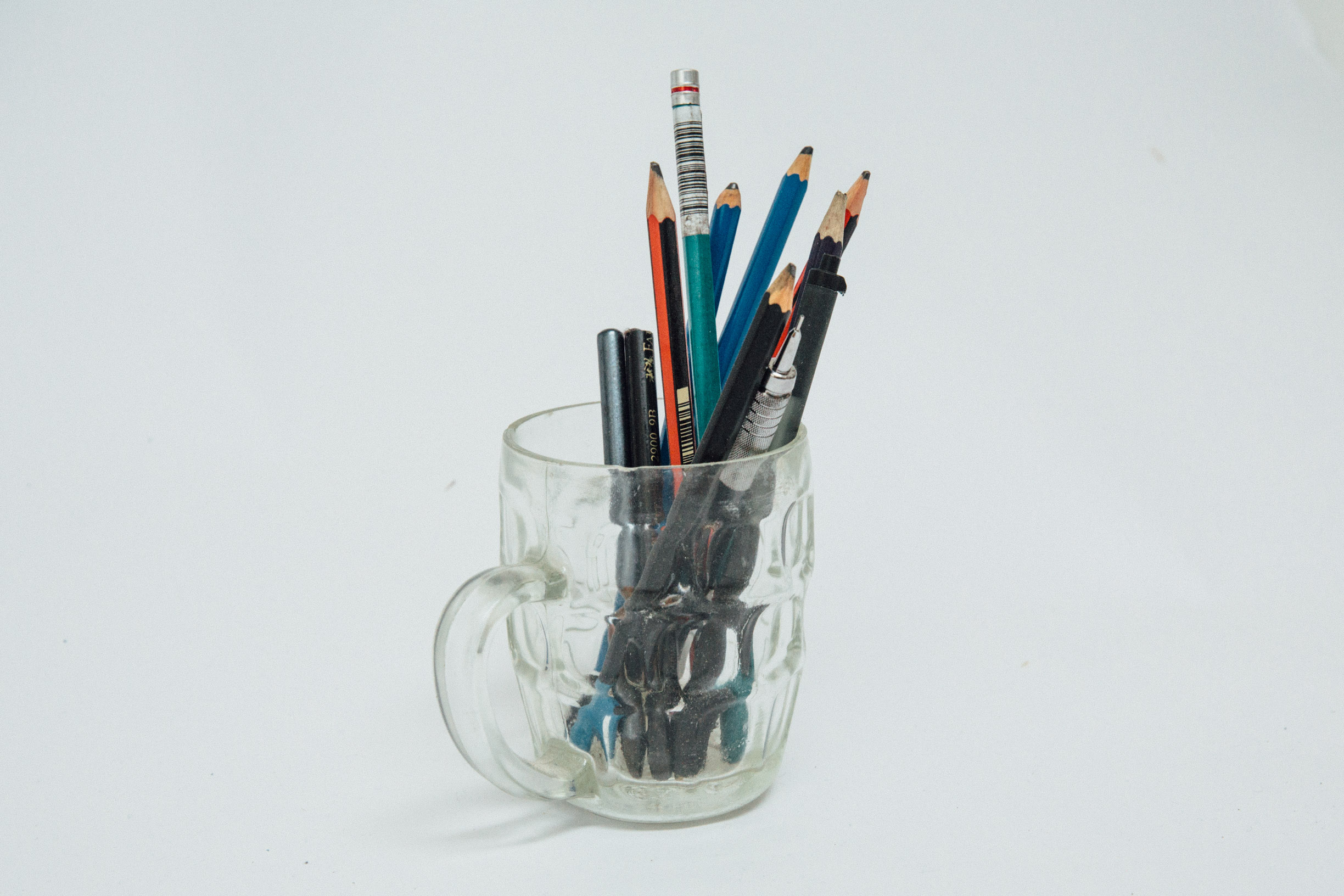
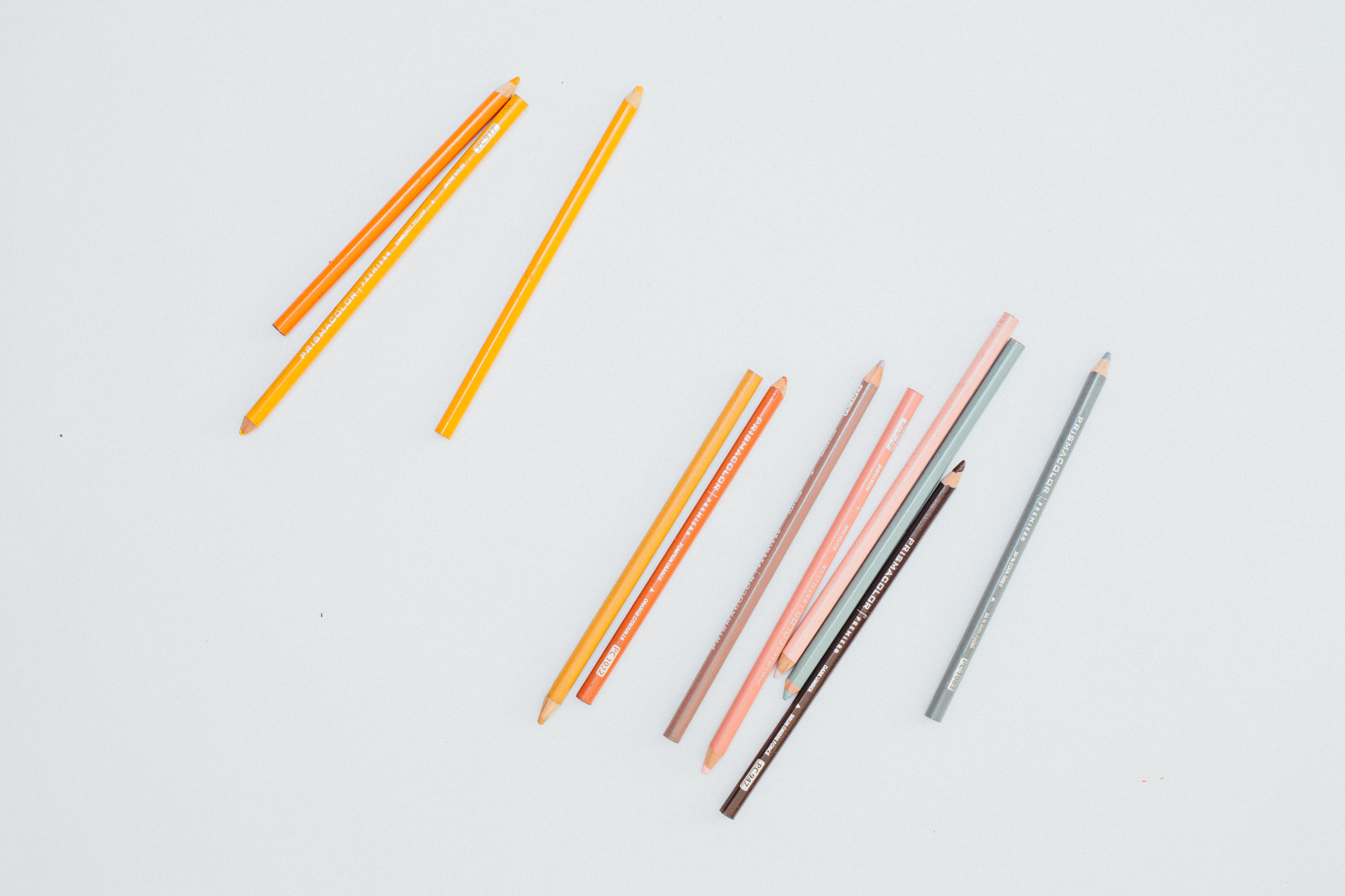
Prismacolor Premier Coloured Pencils
Prismacolor was a brand I discovered through Instagram, I noticed a lot of artist I admired using them and thought I'd give them a go and while they aren't the only coloured pencils I use - they're my favourite and most frequented. The reason I like them is because they are a really soft vibrant pencil, (depending on the colour you're using of course) they can easily be used to detail paintings. My primary use for these is in the planning stage for artwork - because they're so soft it's really easy to get a range of strengths and weights by varying the pressure of your hand; I'll usually begin with really light construction lines and build up to really dark and bold lines.
PENS
Pens aren't a medium you'll see me using very often - I used to use them early on in my art-making for outlining and detailing when my work was more cartoonish, but these days I'll only usually be using one for writing notes, scribbling out ideas, and when I'm travelling for quick rendering. Although they aren't something I use often, I still have preference over the types of pens I buy and use.
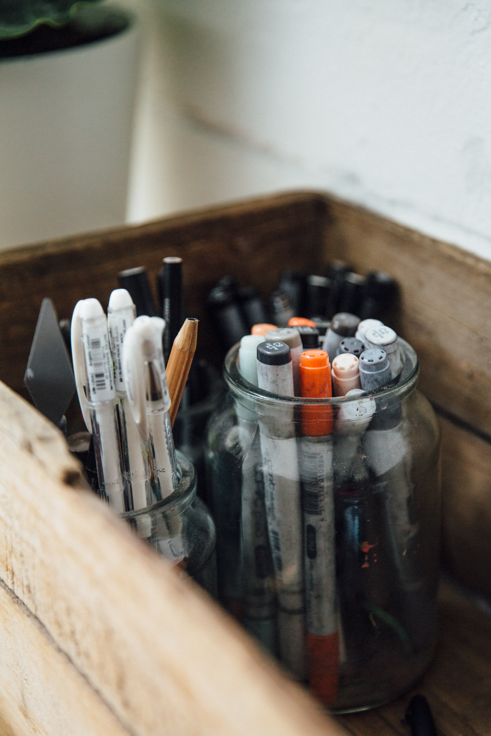
Felt-Tipped Fineliners
I love felt-tipped fineliners, they're my favourite to write with (note-taking, idea scribbling and beyond) as they glide across the paper. I like that they cross over from being a stationary staple, to being a fine-art material (great for drawing, my favourite of which are Artline fineliners & Copic Multiliners.
Copic Fineliners have to be my favourite as they are waterproof after drying which means you can use watercolours or other pens afterwards to render your lined illustrations, they're a lovely warm, rich black, and they come in an incredible range of different nib shapes and sizes. Artline fineliners are a cheaper option and are a cool black, they aren't waterproof so will bleed when wet but are great for writing, or for simple doodling.

Copic Ciao Coloured Markers
Another favourite from Copic, these are the pens I use to render sketchbook illustrations on-the-go. These markers are great because they come in a huge range of colours, are vibrant, they have a nib on each end (one soft brush, one rigid broad nib) which allow you to achieve a range of line weights and styles, they blend together well when wet and are refillable. Having a few different colours can really help you wrap your head around developing palettes for your work.

Annnnnnnnnnnnd that's all folks - we're done with pt. I of the series (yay, you made it!). It feels so refreshing to be able to communicate long-hand through my journal and it's been a pleasure to be able to share my years of trial and error with you.
Happy Valentines Day!
S